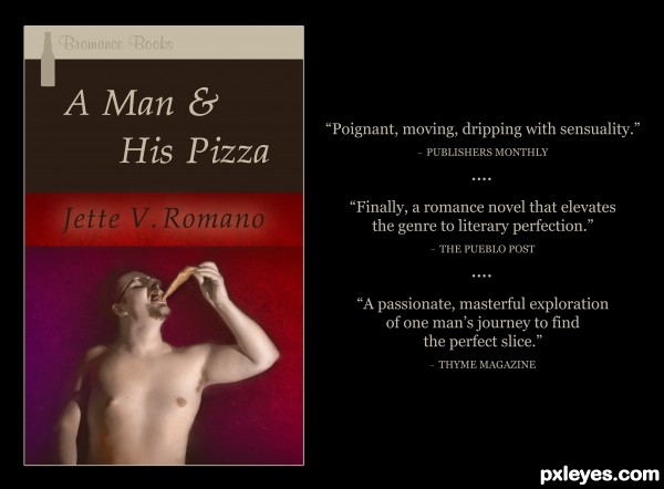
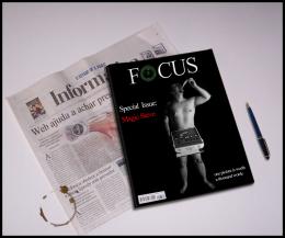
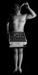
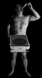
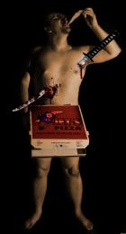
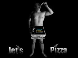
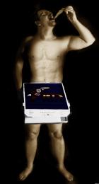
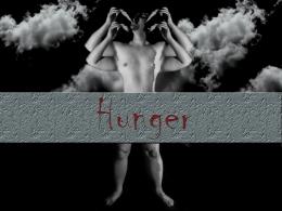
Increased the figure's brightness by 19, contrast by 7. In order to begin colorizing him, I created three color layers over the figure: one beige (layer set to Soft Light), one salmon (layer set to Color), one blue (layer set to Soft Light). I went in with the brush tool (Soft Mechanical, various sizes) to add detail to the color. Burned and dodged here and there, mostly to keep the emphasis on the face and pizza. Used a grunge paper texture for the background, adding a violet gradient. Feathered and faded the figure to let some of the background seep in. Also brushed some of his skin tone into the background here and there to further integrate him. Kept some shadows surrounding the figure in the background, just erasing them lightly. This added variety and more sense of weight. The lighter red bar with the "author's" name is the grunge paper background without a gradient or darkening. I added a faint outer glow to the name because it seemed it might get lost in the red bar. (5 years and 3148 days ago)




Excellent colorization, hilarious reviews!
Truly a fun and imaginative chop. Very well done!
Thank you so much, MossyB!
Very creative use of the most challenging portion of the contest image excellently colorized as MossyB noted. Great type fonts and layout. The 'Thyme Magazine' blurb is inspired.
the brown color band on the title should have the same "textured" look
Howdie stranger!
If you want to rate this picture or participate in this contest, just:
LOGIN HERE or REGISTER FOR FREE