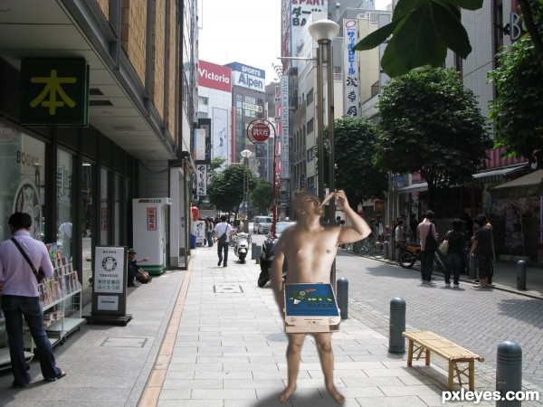
(5 years and 3147 days ago)
1 Source:
- 1: street
The devil made me do it 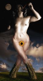 by robvdn 13132 views - final score: 69% | Friday Night 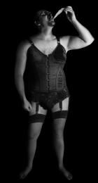 by solkee 11143 views - final score: 66.4% | Without The Box 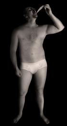 by solkee 11829 views - final score: 63.3% |
I am hungry  by chakra1985 6413 views - final score: 62.8% | Nipple Teeth Pizza Savage  by Drivenslush 9816 views - final score: 62.7% | Eccentricity  by Akassa 4494 views - final score: 62.5% |
A hero he was...  by JimLemon 5698 views - final score: 62.1% | Magazine 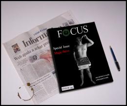 by erathion 5393 views - final score: 61.6% | Bromance Books  by Carnival 10888 views - final score: 61% |
Nice Legs 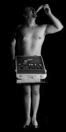 by Nator 6409 views - final score: 60.2% | The Innovation of Charm 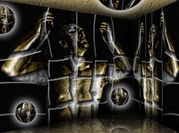 by Drivenslush 5153 views - final score: 59.3% | I got A Free Pizza For This 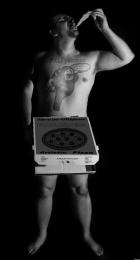 by Chuck 8741 views - final score: 59% |
eat his own pizza 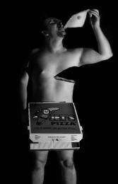 by wooyuenfoo 9871 views - final score: 58.9% | Gluttonous man. 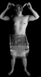 by JoaoN 5978 views - final score: 57.8% | Dying for pizza 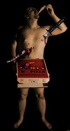 by macknogia 9185 views - final score: 57.4% |
Pizza in the box 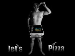 by Yoniz009 10201 views - final score: 56.6% | hot boy or hot pizza? 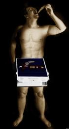 by ivanmarquez 10806 views - final score: 55.4% | Hunger 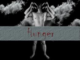 by Yoniz009 10492 views - final score: 55.1% |
int the street 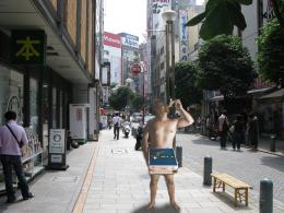 by maozbd 7019 views - final score: 53.4% |
Howdie Guest!
You need to be logged in to rate this entry and participate in the contests!
LOGIN HERE or REGISTER FOR FREE
The shadows on magicsteve do not correspond with the drop shadow beneath him - one is lit from the side, and one from above...If you also look at the other people in the background, you do not see such heavy shadows on one side of them, general ambient lighting is stronger.
You can try using the Dodge tool or Image>Adjustments>Selective Color>Blacks to try to bring it more into line with the rest of the image.
one way to do minimal change is to convert the pizza-guy to a signage instead, with white edges all-round (a cut-out look)
Howdie stranger!
If you want to rate this picture or participate in this contest, just:
LOGIN HERE or REGISTER FOR FREE