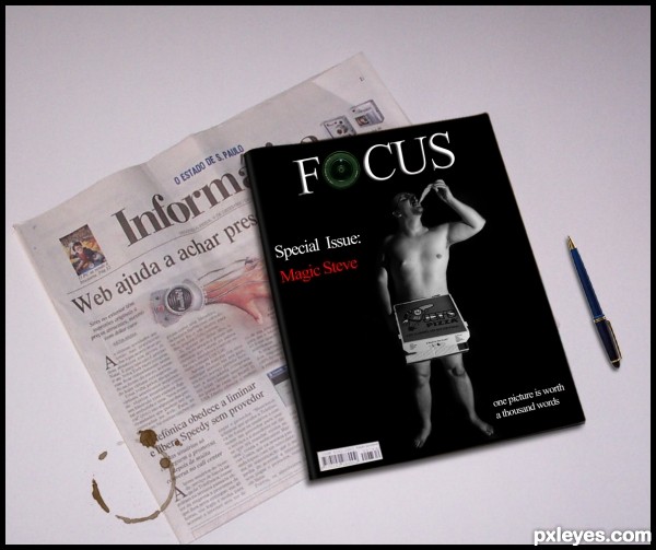
Alex Bernardis-http://www.sxc.hu/profile/asb
Antonio Jiménez Alonso-http://www.sxc.hu/profile/Capgros
Marcin Jochimczyk-http://www.sxc.hu/profile/yochim
Divinity-bliss-http://divinity-bliss.deviantart.com/
Thanks a lot for the resources guys...:) (5 years and 3143 days ago)
















The coffee stain on the paper and table looks too fake. Such a stain would spread on the paper, not be "perfect." There's also too much dead space around your focal point. It would be stronger if you cropped most of that off, and brought the main elements of the newspaper and magazine more into dominance.
Thanks for your comment Mossy. i made some changes about focal point, cropped image. But as for the stain i like how it looks now, and i i had similar stains to this one in real life. if only a little coffee spilled from a cup, stains will look like this. believe me, i have stains like this all the time on my desk and papers. Also about spreading on the paper that is true but only if u have paper such is used on magazine, paper on news paper absorb liquid does not spread. Any how, thanks for your suggestions.
Hey it's Morning Joe! (need a Starbucks Logo) good luck author
good work author
Howdie stranger!
If you want to rate this picture or participate in this contest, just:
LOGIN HERE or REGISTER FOR FREE