
big thank for all the great stock photos :) (5 years and 3135 days ago)
6 Sources:
From Thought to Canvas 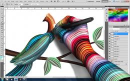 by IDt8r 14971 views - final score: 74% | Early Bird Catches Worm  by bcabilan 17552 views - final score: 67.3% | A House in the Trees 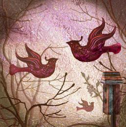 by artgirl1935 10650 views - final score: 66.6% |
I Hide You Go Seek  by Drivenslush 10064 views - final score: 66.2% | towers  by kekskruemel 11594 views - final score: 64.8% | Damn Liberal 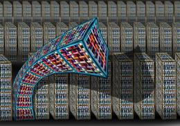 by Drivenslush 5307 views - final score: 64.2% |
Painted Vase and Lonely Orchid  by MossyB 11030 views - final score: 64% | I'm All In 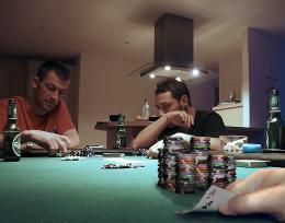 by Majkman 4347 views - final score: 62.2% | In the Vein Inside the Circuit 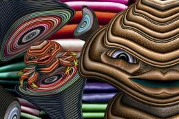 by Drivenslush 6863 views - final score: 61.9% |
CB-1  by lahiripartha 4272 views - final score: 61.8% | library 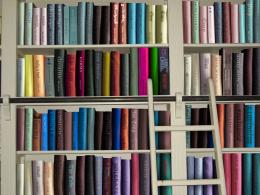 by enblanco 6271 views - final score: 61.6% | x5 strong washing powder  by wooyuenfoo 6429 views - final score: 60.8% |
wasting my soul  by rakib888 7954 views - final score: 60.6% | Not so clean... 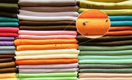 by jordyponce 6455 views - final score: 57.3% | nice room... 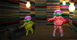 by maozbd 5835 views - final score: 56.4% |
Howdie Guest!
You need to be logged in to rate this entry and participate in the contests!
LOGIN HERE or REGISTER FOR FREE
looks good...

can consider... do a depth-of-field look, blur the further "towers" & background
Nice image.Try blending the edges more they seem hard .
very nice,but i would blur the edges a little just to blend them in a little
The stacks need a darker shadow, they look like they're floating. Also the woman closest looks like she is jumping off the stack not sitting. Perhaps adjusting her dress would make it look more realistic. Good luck!
I really like this style a lot! The mystery and thought provoking mood of this is very pleasing. Wonder how they all got on top of those stacks. Doesn't matter....it's cool. Nice job!
beautiful
Howdie stranger!
If you want to rate this picture or participate in this contest, just:
LOGIN HERE or REGISTER FOR FREE