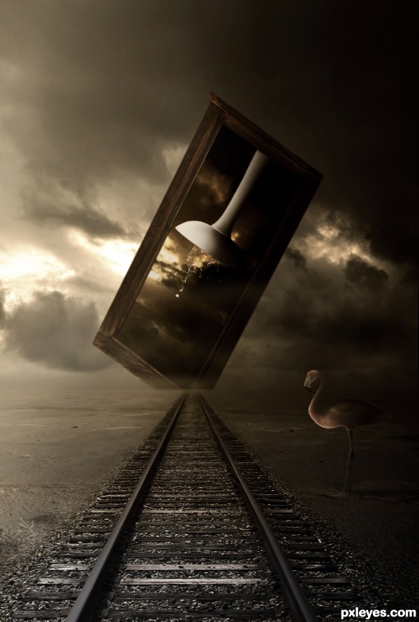
Credits:
http://muttstock.deviantart.com
http://resurgere.deviantart.com
http://dawnallynnstock.deviantart.com
Caro Lander
bas3ssen
night_fate
lousyrats (5 years and 3134 days ago)
7 Sources:
Inside 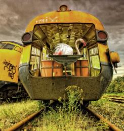 by WYSIWYG 11581 views - final score: 68.7% | Downward Yonder 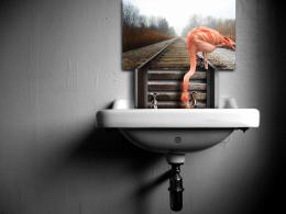 by pixelkid 8959 views - final score: 68.4% | Sinking Path  by Akassa 8979 views - final score: 64.2% |
The sinker 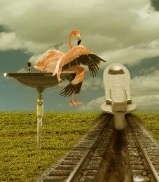 by minnie 5332 views - final score: 63.8% | The Other Way 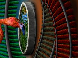 by Drivenslush 6184 views - final score: 62.6% | Journey Back with Me! 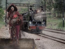 by pearlie 5204 views - final score: 62.4% |
Surreal View 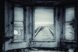 by jordyponce 3839 views - final score: 62.3% | Last Ride into the Sunset 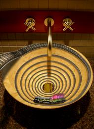 by Majkman 5965 views - final score: 59.6% | Eclectic Decorating 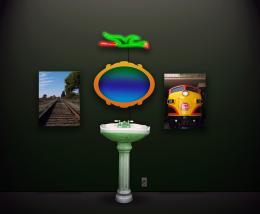 by lchappell 4266 views - final score: 55.6% |
Howdie Guest!
You need to be logged in to rate this entry and participate in the contests!
LOGIN HERE or REGISTER FOR FREE
Intriguing with the odd elements, very constrained color palette, and dramatic brightness difference between the left and right sides, but in the end I just don't get it. While I see a 'path' (the railroad tracks, I assume), the 'sink(ing)' element seems disconnected from those tracks. The window thing encompassing the sink seems nearer than the far end of the tracks so I would expect some shadow from that window onto the tracks. The cut off corner on the window is weird.
Maybe shortening the title to just "Sinking" and making the window/sink element vertical and complete plus positioning it a bit more towards the left side of the image with a ground shadow would be a dramatic contrast against the left-side background and have a surrealistic appeal overall.
Makes me sit on the edge of my seat to see what Lundy comes up with... giggle snort.. great job author.. on a very difficult subject
this is amazing author
good luck
high vote and fav
Congrats for 3rd, nice one
Howdie stranger!
If you want to rate this picture or participate in this contest, just:
LOGIN HERE or REGISTER FOR FREE