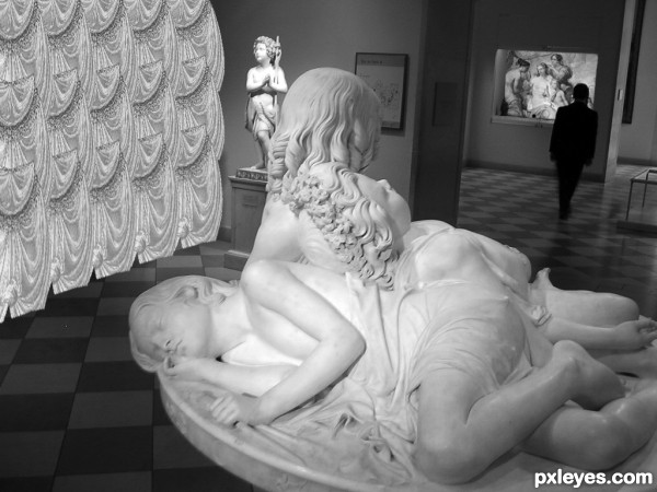
Layer Masks
Desaturate
Free transform
etc.
Used the curtain, middle picture, and blue square design. See if you can find them all :) (5 years and 3133 days ago)
1 Source:
- 1: statue
Parrot  by Ivanildo 13729 views - final score: 70.3% | Dragonfly  by CorneliaMladenova 5627 views - final score: 68.8% | A Gown for Milady  by artgirl1935 9753 views - final score: 63.4% |
Cinderella at 12:09 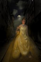 by Majkman 5642 views - final score: 61.6% | way out 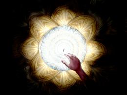 by yllas 6875 views - final score: 61.3% | The Lost Watch 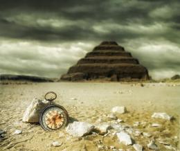 by jordyponce 5723 views - final score: 61% |
The Art Gallery 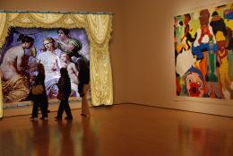 by bryonics 6738 views - final score: 59.3% | Grumble Bumble 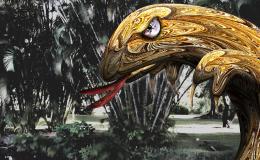 by Drivenslush 3521 views - final score: 58.8% | Chapel ceiling 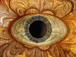 by azuleus 6110 views - final score: 55.2% |
Gallery 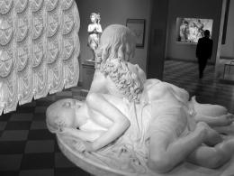 by MGladden 12424 views - final score: 54.4% | nice afternoon 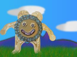 by maozbd 4280 views - final score: 53.5% |
Howdie Guest!
You need to be logged in to rate this entry and participate in the contests!
LOGIN HERE or REGISTER FOR FREE
Good idea -- Curtain on the left needs some adjustment to the lighting as it now has equal brightness across its width so it seem too flat --some dodge and burn would give it some depth
Also the bottom edge IMHO would look better if it was not cut off straight across
Howdie stranger!
If you want to rate this picture or participate in this contest, just:
LOGIN HERE or REGISTER FOR FREE