(5 years and 3135 days ago)
1 Source:
From Thought to Canvas  by IDt8r 14980 views - final score: 74% | Early Bird Catches Worm  by bcabilan 17566 views - final score: 67.3% | A House in the Trees  by artgirl1935 10653 views - final score: 66.6% |
I Hide You Go Seek  by Drivenslush 10072 views - final score: 66.2% | towers  by kekskruemel 11599 views - final score: 64.8% | Damn Liberal  by Drivenslush 5312 views - final score: 64.2% |
Painted Vase and Lonely Orchid 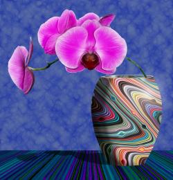 by MossyB 11038 views - final score: 64% | I'm All In  by Majkman 4348 views - final score: 62.2% | In the Vein Inside the Circuit  by Drivenslush 6872 views - final score: 61.9% |
CB-1  by lahiripartha 4275 views - final score: 61.8% | library  by enblanco 6272 views - final score: 61.6% | x5 strong washing powder  by wooyuenfoo 6433 views - final score: 60.8% |
wasting my soul  by rakib888 7956 views - final score: 60.6% | Not so clean...  by jordyponce 6457 views - final score: 57.3% | nice room...  by maozbd 5840 views - final score: 56.4% |
Howdie Guest!
You need to be logged in to rate this entry and participate in the contests!
LOGIN HERE or REGISTER FOR FREE
Thank you so much for the suggestion!
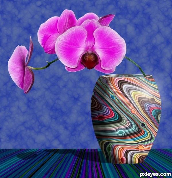
Good design but rather flat looking, needs shadow under the vase, the stem should be leaning on the opposite side inside the vase as the weight of the flowers would designate
If you look, perhaps checking the Hi-Res, you will see that the shadow is to the left behind the vase. Since it is sitting on a level surface, there is no shadow beneath it...
The stem is curved from the weight of the flowers, and hence bends from the base on the left inside the vase, to the right, with the arc then continuing back to the left outside the vase...
Creative and cool. Would love to have seen slightly softer edges to the vase and where wall meets surface. Perhaps a slight soft darkening on right side of edge of vase to show more cylindrical shape...but nonetheless...very nice job.
Since it was supposed to be a tabletop near, but not up against the wall, a softer edge would have helped, you're right.
A shadow on the right side of the vase would have been difficult with the light source highlight where it is, but possibly down near the bottom...
Thank you all for your comments, it is SO helpful to get the viewpoints of other eyes than my own, and helps me improve my skills with every entry!
good try
Great work. Artistic and creative. Fab colours and it includes my favourite subject - flowers!
Howdie stranger!
If you want to rate this picture or participate in this contest, just:
LOGIN HERE or REGISTER FOR FREE