(5 years and 3205 days ago)
1 Source:
- 1: Croc
I WANT TO SEE  by Cicist 17576 views - final score: 65.8% | girl with another eyes  by mounirupa 22157 views - final score: 65.6% | magical eye  by scratzilla1 16212 views - final score: 65.4% |
New Species  by smalapatekut 18194 views - final score: 64.8% | Sexy Cat Woman  by jordyponce 14679 views - final score: 64.7% | Introspective  by Nator 5631 views - final score: 64.3% |
Eye Pods  by Majkman 8994 views - final score: 63.8% | gods eye  by maozbd 12220 views - final score: 63% | Closing eye 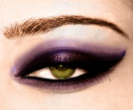 by chakra1985 8106 views - final score: 62.9% |
Iron Eye 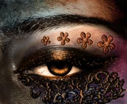 by Mina93 10272 views - final score: 61.3% | beautifull eyee  by mounirupa 11969 views - final score: 60.9% | Chalky Todd  by Drivenslush 5447 views - final score: 60.6% |
See the difference  by Yoniz009 11015 views - final score: 60.2% | Zebra eye  by Mundo 8391 views - final score: 60% | Red Eye 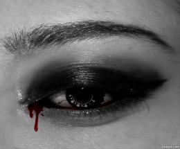 by dlanswayne 7507 views - final score: 59.4% |
flowereye 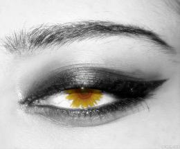 by terryodee 4741 views - final score: 58.8% | eye inside egg 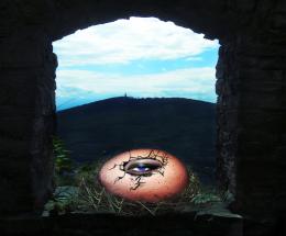 by sasikanth123 14186 views - final score: 58.6% | red eye 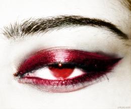 by Dairon16 9956 views - final score: 58.6% |
dangerous eye 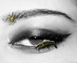 by wooyuenfoo 8028 views - final score: 58% | eye getting small 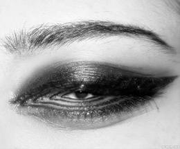 by wooyuenfoo 7550 views - final score: 58% | eye see under the sea  by poetress59 9390 views - final score: 57.7% |
Smokey Eye 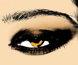 by artbybambi 8840 views - final score: 57% | We Walk Among You 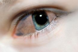 by bryonics 7524 views - final score: 56.6% | WEIRD MAKEUP  by vaibhavrocks1990 7425 views - final score: 56% |
Howdie Guest!
You need to be logged in to rate this entry and participate in the contests!
LOGIN HERE or REGISTER FOR FREE
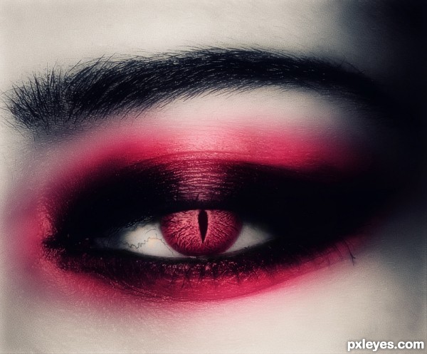
Too dark, color should extend above eyelid.
It was meant to be that dark,"gothic style"..
im gonna try to fix the color part.
The flesh of the eyeball itself looks black...Interesting concept, but the execution looks rushed, without attention to detail with the color just slapped on.
I dont think this was rushed?..thats a bit diferent,..I can call it simple edit, playing with effects..
about the slapped color..there's not a lot of room to play and extend the color..
I tried what I saw was right for my eyes..if mess with color too much,
then it would look like a clown..maybe u are right in the eyeball part..
Thanks for commenting!!.
I love it! ♥, I think I will go with this make up from now on
JoeCacia lol,I think u will look pretty on pink..
Thank you so much author!
I love it! I think the color is great!
I would shade a little more the pupil to give the imagine a bigger dynamic. Very nice idea.
Thanks for all comments!
and thank u Akassa im gonna work on all suggestions.
Fixed the color above eyelid,some dodge tool to give brightness to the eye,.. and shaded a tiny bit the pupil..thanks all for the suggestions.
innovative...
Too blurry..But good peace of thinking.
Howdie stranger!
If you want to rate this picture or participate in this contest, just:
LOGIN HERE or REGISTER FOR FREE