(5 years and 3115 days ago)
I WANT TO SEE  by Cicist 17234 views - final score: 65.8% | girl with another eyes  by mounirupa 21838 views - final score: 65.6% | magical eye  by scratzilla1 16025 views - final score: 65.4% |
New Species  by smalapatekut 17864 views - final score: 64.8% | Sexy Cat Woman  by jordyponce 14357 views - final score: 64.7% | Introspective 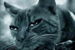 by Nator 5553 views - final score: 64.3% |
Eye Pods 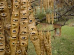 by Majkman 8827 views - final score: 63.8% | gods eye 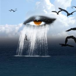 by maozbd 12007 views - final score: 63% | Closing eye 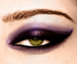 by chakra1985 7945 views - final score: 62.9% |
Iron Eye 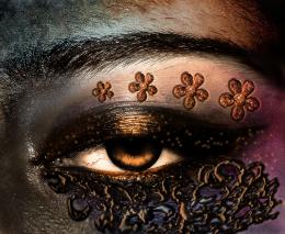 by Mina93 10057 views - final score: 61.3% | beautifull eyee 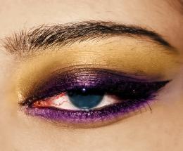 by mounirupa 11774 views - final score: 60.9% | Chalky Todd  by Drivenslush 5339 views - final score: 60.6% |
See the difference 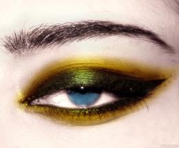 by Yoniz009 10722 views - final score: 60.2% | Zebra eye 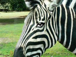 by Mundo 8168 views - final score: 60% | Red Eye 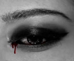 by dlanswayne 7392 views - final score: 59.4% |
flowereye 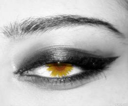 by terryodee 4662 views - final score: 58.8% | eye inside egg 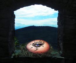 by sasikanth123 13985 views - final score: 58.6% | red eye 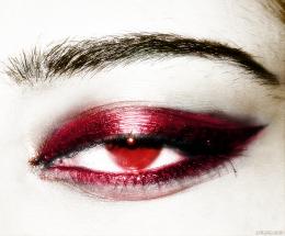 by Dairon16 9806 views - final score: 58.6% |
dangerous eye 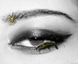 by wooyuenfoo 7897 views - final score: 58% | eye getting small 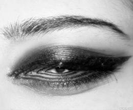 by wooyuenfoo 7337 views - final score: 58% | eye see under the sea  by poetress59 9160 views - final score: 57.7% |
Smokey Eye 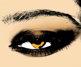 by artbybambi 8704 views - final score: 57% | We Walk Among You  by bryonics 7340 views - final score: 56.6% | WEIRD MAKEUP  by vaibhavrocks1990 7245 views - final score: 56% |
Howdie Guest!
You need to be logged in to rate this entry and participate in the contests!
LOGIN HERE or REGISTER FOR FREE
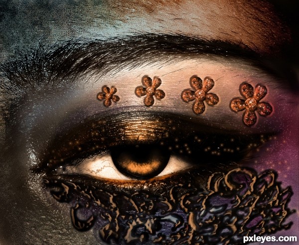
This was better before. Now you've "Burnt" the left hand side, which makes the decoration on the lower part of the eye look odd and out of place. A bit too extreme of a value adjustment. "Less is more."
The marks on the bottom look really saturated. Great skin coloring.
Mossyb I'll try to do what you suggested ..
..
Oh thanks AKassa ...
This looks so dreamy like! I love the tone and how you decorated the eye!
One thing I see and it might be wrong, if you put less flowers on the lower part of the eye? But all in all is great!
I have lighten some areas I hope it look better now?!.......
 .....About less the flowers!! amm it was my idea to make them like that when I first start to create this ...I don't know if I less them maybe it will be out of what I want it to be..
Well thank you so much JoeCacia
Now when lighting it up it looked much better and I can see your work! Wonderful author!
the work on skin and the eye itself is very good, but the interlaced decoration under the eye does not really belong there, here is a reference for the face decoration in case you want to improve:

http://www.flickr.com/photos/31078888@N03/4349125398/
good job overall and good luck
EDIT: .... It surely not a disaster if you leave it as it is, after all it's still a good piece of art, i was just trying to help
Hey thanks for the advice I appreciate it,amm i think that am gonna leave it just like it's,it's really okay if I didn't win after all...it's not the end of the world haha
Very Good!! GL
Howdie stranger!
If you want to rate this picture or participate in this contest, just:
LOGIN HERE or REGISTER FOR FREE