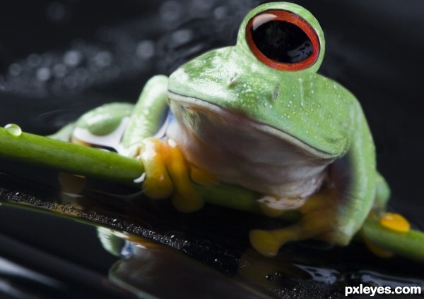
(5 years and 3105 days ago)
1 Source:
- 1: source1
The Collective  by Drivenslush 13125 views - final score: 68% | tamarine cyclop  by sande1001 18418 views - final score: 66.3% | CYCLOPE XXS  by lolu 26932 views - final score: 65% |
After a freak accident!  by bcabilan 19534 views - final score: 64.2% | frog  by Se7eN0f9 12508 views - final score: 64.1% | soldier cyclop  by sande1001 7673 views - final score: 63.4% |
Lady Eau de toilette  by Drivenslush 6948 views - final score: 63.3% | kittens  by Se7eN0f9 13755 views - final score: 62.7% | Portrait of a Cyclop  by Mikaelbg 8245 views - final score: 61% |
I can see  by antaroop2010 8351 views - final score: 61% | Richard and Philip 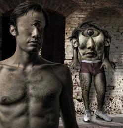 by Drivenslush 7406 views - final score: 60.4% | Quack, quack! 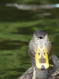 by poetress59 6474 views - final score: 59.9% |
man in one eye  by wooyuenfoo 12942 views - final score: 59.7% | Cyclops-Vicuna  by omercb 5607 views - final score: 59.4% | Hoot, I have my eye on you 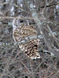 by poetress59 9078 views - final score: 59.4% |
There's a hair in my eye 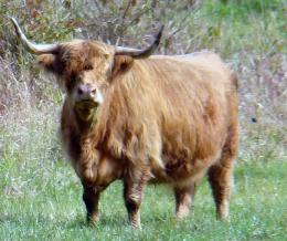 by poetress59 7143 views - final score: 58.2% |
Howdie Guest!
You need to be logged in to rate this entry and participate in the contests!
LOGIN HERE or REGISTER FOR FREE
I think the addition of a white Light Strike in the eye will give it more moistness ... IMHO... it's looking a bit flat without something to make the black center so stark.. up to you author.. the blending in High Res is AWESOME!!! very good job!
EDIT: Yes much better.. GOOD LUCK!!!
thx drivenslush, u were right, put some light in it, hopes it looks better now, imho it does!
Would have been better if you kept the vertical slit pupil from the eye of the original frog to make this more realistic. The eye still needs more of a highlight...look at your source pic.
I think i leave the eye this way cmyk46, i added some highlight though
Looks neat, very good idea.
THats funny!
Look cute..luv it..
Howdie stranger!
If you want to rate this picture or participate in this contest, just:
LOGIN HERE or REGISTER FOR FREE