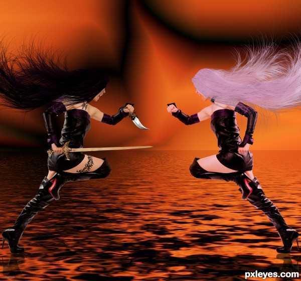
made the background with gradient tool set to difference and color orange to black, then added the flood filter (5 years and 3109 days ago)
7 Sources:
new style  by smalapatekut 31680 views - final score: 72.7% | Gone Gothic 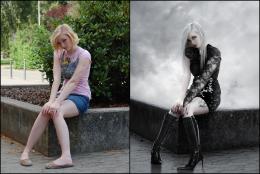 by Akassa 24947 views - final score: 72.4% | Hey Sweetie 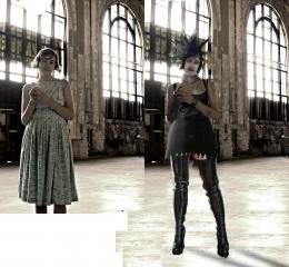 by Majkman 16003 views - final score: 60.4% |
Runaway Rocker  by SaEllisson 14374 views - final score: 59.6% | good vs bad  by Se7eN0f9 17501 views - final score: 58.9% | Good-n-Evil at Peace  by bigjake 5464 views - final score: 58.6% |
Howdie Guest!
You need to be logged in to rate this entry and participate in the contests!
LOGIN HERE or REGISTER FOR FREE
I think she already looks bad on the original picture :P nice composition tho.
Ummm...what makes the woman at right good...pink hair?
uh well she also is not carrying a sword, knife and tattoos... the contest is to make her look bad well i did imho
uh well she also is not carrying a sword, knife and tattoos, and the fangs..... the contest is to make her look bad, well in my opion i did...
The only thing im not crazy about is the ground. If they're on water, ok. But there should be some sort of ripple or splash. Nice work though.
Howdie stranger!
If you want to rate this picture or participate in this contest, just:
LOGIN HERE or REGISTER FOR FREE