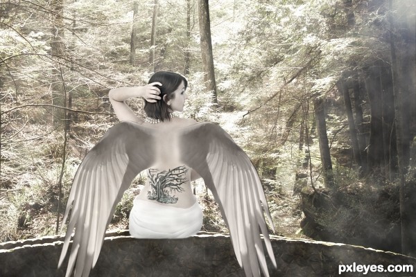
I used two sources:
Thanks to : marykbaird (for the background photo).
Thanks to : matthew_hull ( for the egret wing photo). (5 years and 3105 days ago)
2 Sources:
Bathroom  by smalapatekut 28804 views - final score: 67.7% | Walking on Sunset  by DanielaOwergoor 17290 views - final score: 66.7% | my soul is not for sale  by dreamboy 36159 views - final score: 65.6% |
Hocus Pocus  by artgirl1935 11453 views - final score: 65.4% | princa  by itsdesign 9579 views - final score: 64.5% | Is it the same?  by Yoniz009 8199 views - final score: 61.9% |
Merm Godes 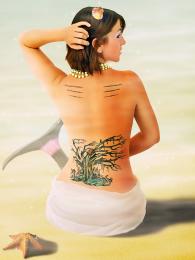 by itsdesign 7203 views - final score: 61.5% | tattoo by moonlight 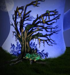 by scratzilla1 10162 views - final score: 61.1% | Green Pearl  by jadedink 11574 views - final score: 61% |
Colorful world 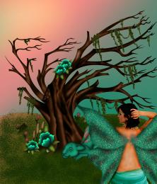 by chakra1985 7877 views - final score: 60.9% | Famous  by SaEllisson 10280 views - final score: 60.5% | in the autumn lake..  by theni2005 11083 views - final score: 59.6% |
Ambras Syndrome Royal 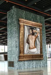 by Drivenslush 13411 views - final score: 59.6% | DAME NATURE  by lolu 9258 views - final score: 59.3% | Sultan Does Swing  by Drivenslush 8001 views - final score: 59% |
Angel???  by waiphyo 10694 views - final score: 58.9% | Reflections of Beauty  by poetress59 10545 views - final score: 58.7% | Snow princess  by poetress59 7432 views - final score: 58% |
nature live  by sande1001 17142 views - final score: 57.5% | her own tattoo  by wooyuenfoo 12566 views - final score: 57.2% | Sleeping cat  by Rik 10282 views - final score: 55.4% |
Japanese Painting  by PSA2009 7518 views - final score: 54.8% |
Howdie Guest!
You need to be logged in to rate this entry and participate in the contests!
LOGIN HERE or REGISTER FOR FREE
nice concept,
in hi res you can see that the wings don't cover the tattoo where they should, for some reason the tatto covers the wings.
but still, very nice and GL!
Thanks omercb. I've made a mistake with a masking. I've fixed it now. Thanks for your advice.
good use of sources and nice colours.. lovely entry author
Thanks you, scratzilla1.
Great concept, i think the blending could just use a bit more attention and IMO i would try to match the wings up with the shoulder again great job.
Thanks you, bigjake.
the part where the wings blend with the body should be improved, the tattoo should fade-in more (not so sharp n clear), a more arched wings would be better
Howdie stranger!
If you want to rate this picture or participate in this contest, just:
LOGIN HERE or REGISTER FOR FREE