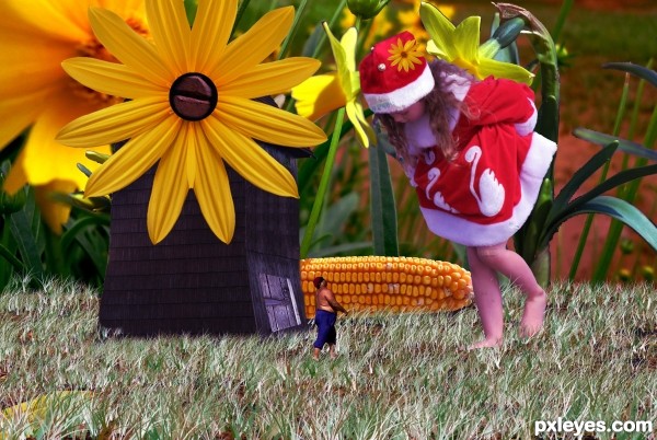
(5 years and 3106 days ago)
7 Sources:
- 1: Girl Thanks: mikkimoo
- 2: Dwarf
- 3: mill
- 4: Flowers
- 5: Background1
- 6: Background2
- 7: Screw

(5 years and 3106 days ago)
Princess of Petals  by orientallad 17857 views - final score: 71.4% | Wings Around the Daisies  by artgirl1935 14054 views - final score: 68.9% | Floating Daisy Balls  by Drivenslush 16907 views - final score: 65.7% |
Garden Pixie  by SaEllisson 20785 views - final score: 63.7% | Yellow love  by itsdesign 13295 views - final score: 62.4% | Fighting Flowers 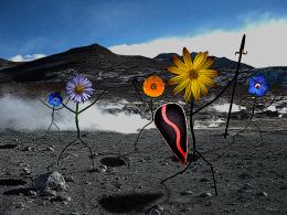 by omercb 15112 views - final score: 62.3% |
flower girl  by wooyuenfoo 5576 views - final score: 61.7% | Butterfly on Flower  by Drivenslush 7937 views - final score: 60.9% | BOUTON D'OR  by lolu 5746 views - final score: 60.5% |
Fashion show  by Yoniz009 6519 views - final score: 59.8% | The Guardian  by nbaztec 4994 views - final score: 59.4% | Alice's in Wonderland 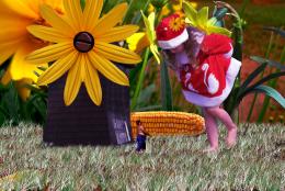 by mo_ta2007 8971 views - final score: 57.2% |
Howdie Guest!
You need to be logged in to rate this entry and participate in the contests!
LOGIN HERE or REGISTER FOR FREE
Its a very nice scene you have setup there, but you need to work on some details to make this a winner the daffodils on the right, you need to cut them out way better.. I dont know what you used but you cut parts of the leafs n more. theres a black outline on the flowerpetals aswell. I like to suggest you to use the pentool for the cutout, if you dont now how then heres a very good tutorial for beginners with pentool. http://www.melissaevans.com/tutorials/how-to-use-photoshops-pen-tool/1 page 1 explains the pentool and page 2 tells you bhow to cut out using the pentool. The floor the girl is standing on, remove it and make her feet stand in the sand, also i dont understand what happened to her feet they are all wobbly
 good luck
The mill arms that are still vissible you can cover up by using parts of the mill with the same structure. copy past and even flip parts that you can use.
If you work on these things then you can really have a nice scene here
author, as Elad has said, you have a very winning concept here, but the Hi Res shows a LOT of detail that will give you low votes, especially from the more powerful voters... the design is FANTASTIC but the detail needs to be refined.. GOOD LUCK!!!
Thank you, thanks to you i turn improve Foals
there you go.. is a far better scene now nice job on the mill too to cover up the wings.. the main thing thats bothering now is the cutout of the dafodils they have a black and greyish outline and miss parts in the leafs.
Howdie stranger!
If you want to rate this picture or participate in this contest, just:
LOGIN HERE or REGISTER FOR FREE