
(5 years and 3099 days ago)
3 Sources:
Dredin 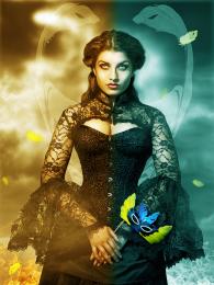 by itsdesign 10481 views - final score: 66.3% | Masktress 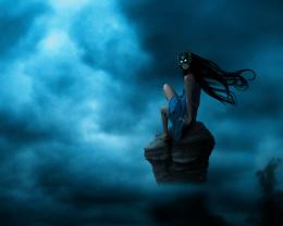 by rufkut 12584 views - final score: 65.8% | The Guardian 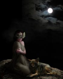 by George55 8631 views - final score: 63.9% |
Not your ordinary kitty 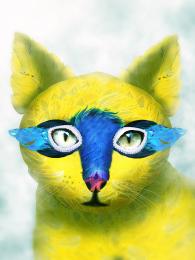 by itsdesign 9238 views - final score: 62.9% | Birds 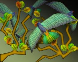 by WYSIWYG 8253 views - final score: 62.8% | Bird Lady 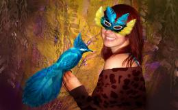 by artgirl1935 5009 views - final score: 62% |
magic mask 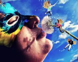 by Glam0urGirl2007 6299 views - final score: 61.1% | Mr Carnivale 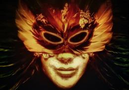 by jordyponce 3143 views - final score: 60.8% |
Howdie Guest!
You need to be logged in to rate this entry and participate in the contests!
LOGIN HERE or REGISTER FOR FREE
Very nice choices -- think the transition between the thumb and the handle of the mask needs a touch up -- appears the handle is going thru the thumb not under it -- bit of shadow from the thumb to the handle and maybe extend the handle to the gap between the thumb and finger
Thnx Alan
This image kinda gives me an art nouveau impression
yes , yes , yes!!! I love your sources, the dual colour balance on this image works well and although i think your model is more of the focus point for me than the mask you have used the main source creatively and in many places within your image.
WELL DONE >> OFF TO THE FAVS!
Beautiful, love the colours GL
GL
I really love this, nicely done
great image..good color fx
Great colour choicesm great image sources and most importantly that the author blended them very well - thumbs up
That's a great work, especially on using colors. There are somethings that might be helpful to you if you want to improve further: (1) The size of the mask is quite small compared to her face, you can use the distance between her eyes as the standard and enlarge the mask to fit it; (2) The saturation level of the mask is noticeably higher than the rest while the colors of the character are quite muted. If you use the blue filter for the mask, it would fit more to the image; (3) There are many black dots on the image, I don't know your purpose but they are quite distracting. Best work so far!!
Thanks guys for the wonderful comments @ Langstrum thnx for the tips, am ever learning, you made great observations...strangely i used the distance between d eyes to size the mask ...the dots were our of my creativity..but all note taken..Thanks
Magnificent
Congrats !
Well done...congrants
Congrats, nicely done
hey congrats!
Congrats itsdesign for first place.
Thanks guys for the vote and comments..much appreciated
Congrats for first.....!
Howdie stranger!
If you want to rate this picture or participate in this contest, just:
LOGIN HERE or REGISTER FOR FREE