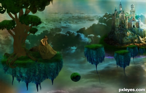
Used stock off of deviant art from AttempteStock
Skinywitch
and Skybase.
Source image and one of my own images. (5 years and 3161 days ago)
Give Thanks  by artgirl1935 11151 views - final score: 70.6% | Banished  by TwilightMuse 9717 views - final score: 64.9% | Carrot God  by darkshellie23 17251 views - final score: 64.9% |
bird  by flyhigh 8145 views - final score: 63.5% | The sultan of Radish  by minnie 8428 views - final score: 61.3% | The Tree  by TwilightMuse 8579 views - final score: 60.8% |
You've Lost your Muchness  by Drivenslush 7485 views - final score: 60.5% | Just me and the snow...  by JimLemon 7083 views - final score: 60.5% | The Floating Life  by Drivenslush 5869 views - final score: 60.3% |
Fish Need Vegetables Too! 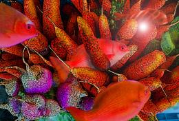 by featherst 9796 views - final score: 59.8% | Carrot Robot 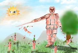 by HeinHtetSwe 9500 views - final score: 59.2% | happy radishes 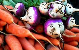 by ciulama 5534 views - final score: 57.8% |
Howdie Guest!
You need to be logged in to rate this entry and participate in the contests!
LOGIN HERE or REGISTER FOR FREE
Interesting image but to small usage of the source image...
I used the source image everywhere. The islands were entirely source, the whole tree with the exception of a gradient layer, the rock behind the girl, background overlay. I don't know what more I could do at this point unless, make a castle out of carrots?
it could use a bit of a whole dodge wash or some sort of brightening filter to bring up the detail (this could be my eyes but the image looks dark and a bit mushy) it's a great image overall and as always IMHO.. good hard work
Suggest creating more contrast between foreground & background. Would also be good to light the floating things the same as the castle.
Thank you for the feedback, it certainly helps, sometimes while creating a manipulation I get a story in my head and become one minded about where that image should go. In this one, the girl was banished from the castle so the overall mood was dark except for some light on the castle. I attempted to fix it up by adding more gold light layers, one primarily on the girl and tree. Hope this helped some. Wasn't sure what to do to create a contrast between the foreground and background though other than darkening or brightening one.
this is a great peace of art and i can tell you put some efort into it.
i'm just trying to find where did you use the original carrot file that was provided for this contest. of course it may be just me who isnt finding it.
good job anyways
I like it when there is a story behind an image. Already some nice work here, but there is room for improvement.
To increase the contrast between foreground and background you could shift the hue of the foreground more to yellow or orange. Also, it would be nice if the tree was much bigger, extending more to the right. If you only show a small part of the leaves, it will give the impression that the whole tree is huge.
If you read the previous comment and go through the sbs it'll show the carrots and radishes use.
@pshoudini: Maybe you should look at the SBS before commenting. It always helps.
Congrats!!
Howdie stranger!
If you want to rate this picture or participate in this contest, just:
LOGIN HERE or REGISTER FOR FREE