(5 years and 3083 days ago)
3 Sources:
StylaVase  by artgirl1935 7591 views - final score: 70% | Portal Engine  by Akassa 12709 views - final score: 69% | The Awakening  by George55 8427 views - final score: 68.7% |
Aqua Surreal  by loopyluv 8744 views - final score: 66.2% | Waiting  by WYSIWYG 9694 views - final score: 65.1% | ...Page 57  by Drivenslush 5523 views - final score: 64.2% |
OMG, I missed my halloween  by dekwid 8195 views - final score: 63.6% | Please Write Soon... Missing U  by Drivenslush 8654 views - final score: 61.7% | Fight  by WYSIWYG 4321 views - final score: 61.5% |
Howdie Guest!
You need to be logged in to rate this entry and participate in the contests!
LOGIN HERE or REGISTER FOR FREE
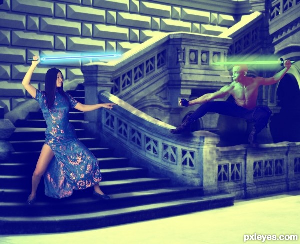
The glows should only be on the weapon end of the swords, which would glow from the insides and not have shadows. You've made the background too dark to let the figures pop. This could be great with some tweaks. GL author.
You were absolutely right did some changes, based on your comments. Thanks!
Much improved!

The image looks a little flat on my monitor and i guess it will improve when you increase the contrast with levels or curves. Also, the background is lit by strong directed light, but the figures (esp. the girl) are more evenly lit.
On the happy side, it is a well composed image and the relative propertions seems to be ok. So, i'll be happy to see you can make it even better.
The lights are all different...
Too much green for me. Too many distractions IMO.
But a nice idea. Good luck
Howdie stranger!
If you want to rate this picture or participate in this contest, just:
LOGIN HERE or REGISTER FOR FREE