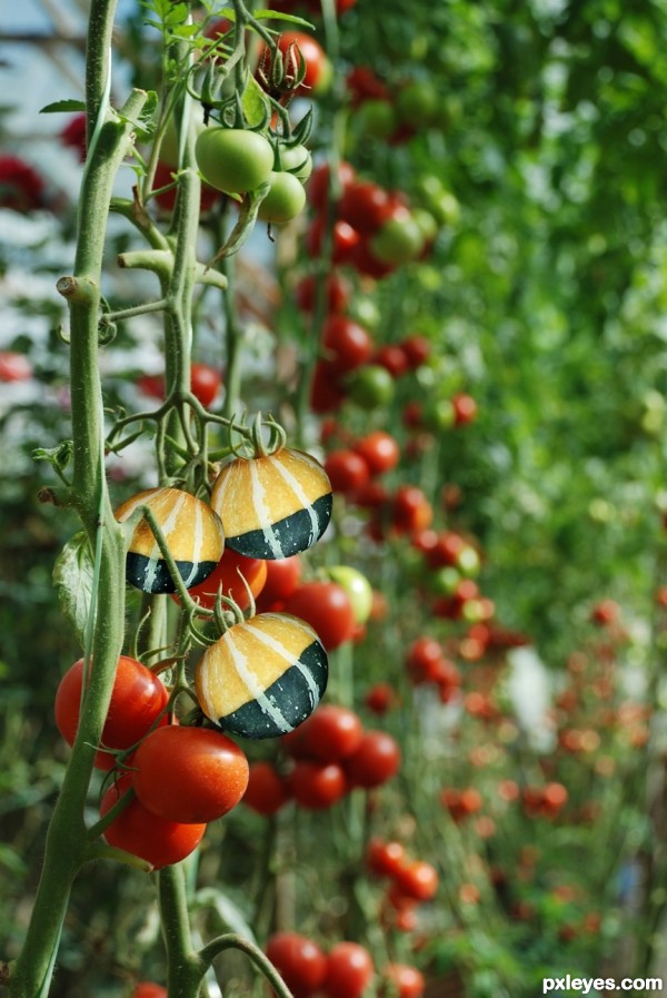
(5 years and 3060 days ago)
My Fantasy World 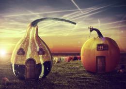 by DanielaOwergoor 11633 views - final score: 69.7% | Gourdgeous Goose Family 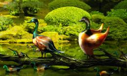 by artgirl1935 11623 views - final score: 67.5% | Bird 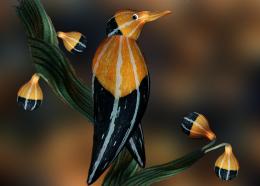 by lahiripartha 8116 views - final score: 63.7% |
egg's creative hen 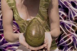 by enblanco 13618 views - final score: 62.8% | The little family 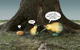 by CMYK46 8409 views - final score: 62.5% | Sky Lanterns 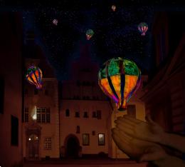 by MossyB 9394 views - final score: 60.4% |
Silence 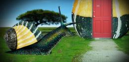 by Yoniz009 7187 views - final score: 60.2% | wrong place 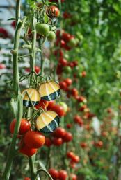 by wooyuenfoo 6513 views - final score: 59.9% | pumpkin's heat  by enblanco 7974 views - final score: 59.3% |
They Were Squashed 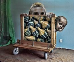 by Drivenslush 7130 views - final score: 58.4% |
Howdie Guest!
You need to be logged in to rate this entry and participate in the contests!
LOGIN HERE or REGISTER FOR FREE
Using the BURN brush on the squashes left undersides to match the shading on the tomatoes will make it look more realistic (fantastic Idea) IMHO
Its a lot of work but id liked it better if u had replace all of the tomatoes on the stem with these squash, the squash look a little overexposed imo other wise the quality is good.
thanks! Drivenslush & Eladine........
Howdie stranger!
If you want to rate this picture or participate in this contest, just:
LOGIN HERE or REGISTER FOR FREE