
i wish i had more time to finalize some things on this entry, and to make sbs..if i didn't catch the deadline i'll try to put it in the comments...
credits to:
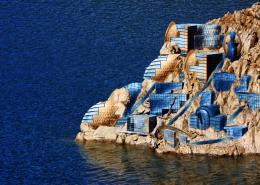
xesko82 fro sxc.hu for Illes Medes image
somadjinn from DA for air balloons iamge
mindCollision-stock from DA for little island iamge
darkrose42-stock from DA for stormy sea image
Titelgestalten from DA for rope image..
also thanks to wikimedia commons, imageafter and cgtextures for stock images..
just to mention, leaf image was used to define brush,and with that brush (adjusted space and scattering) painted over islands and ropes..
link to leaf source :
http://www.cgtextures.com/texview.php?id=8580&PHPSESSID=ieh1js9sk15gu9b7uqk7eapvi5 (5 years and 3076 days ago)

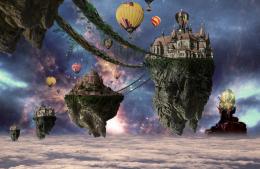
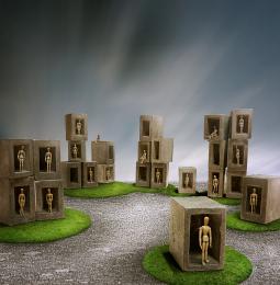
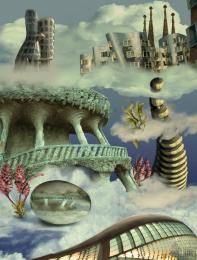
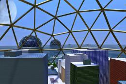
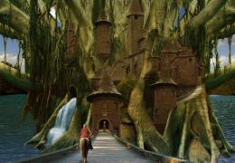
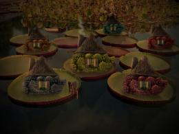
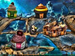
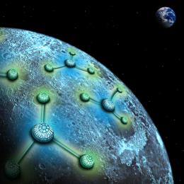


Good treatment of a subject that's been done badly so many times.
I like this image a lot except theres hardly or none play with lights or shades on the building on the front/big floating isle while that captures ur attention the first. It makes it look a little flat. Perhaps you can liven it up somehow that building. I will put it on my favs anyway because its a very nice image. well done.
this is really well done..i see you put a lot off effort into this and so many source images merged together....the only think i'd try to work on or get rid of instead is that lower right statue of angels. or add some soft cloud brush over it or burr it a bit to give a DOF view.
other than this, one of my top piks
good luck
I like the variation of island bottoms! Perhaps if you darken a few of the highlights of the further island bottoms...it will vary it even more! Nice work, author!
This must have taken some time, the results show it.
That one balloon that's exactly centered behind that tower is a distraction from an otherwise great piece of work.
thanks for the feedback i agree, some tweaks here and there will improve the image, but i ran out of time... actually i started with this some 20-24 hours before the deadline, so i didn't had time for some adjustments..well, i have to be happy with what i got
and here is small WIP ...
http://s6.postimage.org/q0de4nt6p/fantasy_wip.gif
Great job and win !!
Congrats!!
Congrats !
Congrats, very nice work
Congrats
Congrats!
great job and well deserved win...congrats
Howdie stranger!
If you want to rate this picture or participate in this contest, just:
LOGIN HERE or REGISTER FOR FREE