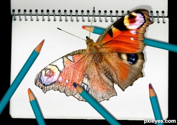
sketch book and coloured pencils scanned in from objects at hand (5 years and 3154 days ago)
1 Source:
Grundg Warrior  by Glockman 18061 views - final score: 81.4% | Welcome to our Eyeland  by langstrum 17338 views - final score: 78.7% | Alone In The Battlefield  by orientallad 13459 views - final score: 70.2% |
Daydreaming  by fatz8016 9556 views - final score: 68.4% | Foot Tongue  by tnaylor21286 19832 views - final score: 66.3% | Sauron and the Hell Beasts 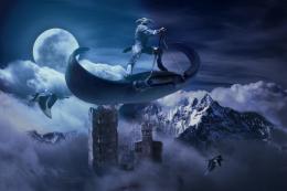 by lchappell 10962 views - final score: 66.1% |
stranded  by Se7eN0f9 6004 views - final score: 65% | haunted land 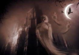 by Rellikk 14263 views - final score: 64.6% | Beautiful Whiteness 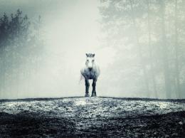 by jordyponce 6227 views - final score: 63.9% |
Smoke Butterfly 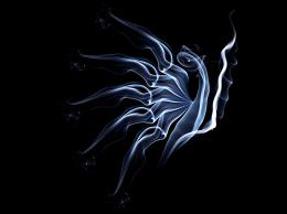 by riady 13328 views - final score: 62.4% | too real 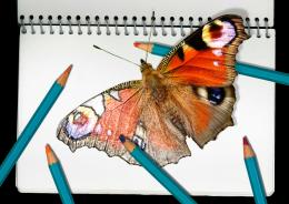 by rsguetre 12006 views - final score: 62.2% | WATERMAN  by cterraza 9309 views - final score: 60.7% |
The Little Intruder  by jordyponce 6208 views - final score: 60.2% | first work  by Rellikk 6983 views - final score: 58.7% | Elephant  by vertigo 6467 views - final score: 58.5% |
The Baby Experiment  by jordyponce 7509 views - final score: 58.1% |
Howdie Guest!
You need to be logged in to rate this entry and participate in the contests!
LOGIN HERE or REGISTER FOR FREE
I liked it better if the image was turned in a diff direction so there would be more shadows fallen on the butterfly..
Thanks for that comment, I guess I don't know what you mean by turning the image in a different direction because I don't know how that would cause the shadow to fall on the butterfly ... unless the wing were raised up high enough to cast a shadow on the other side, which I don't want to do because then the raised wing would look quite small because of foreshortening.
I mean more shadows from the pencils on top of the drawn wing sorry I was not clear right now it only gets shadow on it from the one pencil and only very small part which is hard to see.
good eye! thanx for the suggestion...
Nice work! Love the bright colors.
yes! thats what I meant looking better now
This is a fairly nice looking piece of ...filter work. Your blending between the "sketched" part and the live butterfly is commendable. There are however some inconsistencies in the shadows. Look at the shadows cast from the binder's rings versus the shadows of those pencils and the butterfly.
Nice blend and creative thinking. I like this kind of style in general!
Thanks for the helpful comments and encouragement, I was so worried about the shadows in and around the butterfly and pencils and completely overlooked the others...
pixelkid -- this kind of stuff is what I like about photoshop too: something that can't be done purely photographically, nor can it be done with paints or pencils alone.
Howdie stranger!
If you want to rate this picture or participate in this contest, just:
LOGIN HERE or REGISTER FOR FREE