
Exiting your persona can lead to better or worse things. Made adjustments from the suggestions given. Thanks! See high resolution. (5 years and 3067 days ago)
6 Sources:
Ulterior Path 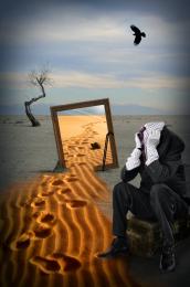 by pixelkid 12198 views - final score: 69.7% | pulling  by Se7eN0f9 11032 views - final score: 69.4% | Mind  by tnaylor21286 8927 views - final score: 67.9% |
Bath for two in Egypt  by jordyponce 12903 views - final score: 66.5% | They're biting today 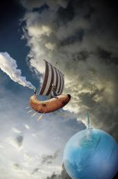 by CMYK46 10160 views - final score: 65.8% | TRIO 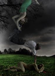 by lolu 6782 views - final score: 65.5% |
The Flavor of Powdered Water  by Drivenslush 9971 views - final score: 65.3% | Me' Mates are Me' Life  by Drivenslush 8271 views - final score: 60.8% | Bad day for this outfit  by jordyponce 10347 views - final score: 60.4% |
Howdie Guest!
You need to be logged in to rate this entry and participate in the contests!
LOGIN HERE or REGISTER FOR FREE
Photography and photoshop contests
We are a community of people with
a passion for photography, graphics and art in general.
Every day new photoshop
and photography contests are posted to compete in. We also have one weekly drawing contest
and one weekly 3D contest!
Participation is 100% free!
Just
register and get
started!
Good luck!
© 2015 Pxleyes.com. All rights reserved.


Very nice. I might do some more soft erasing on the left side of the foreground sand, but it's a well made and intriguing image. GL author.
Try to work a little bit more on the feet on the sand it's make not realistic ! otherwise good work !
good collection of sources put together well
CMYK and lolu: Thanks so much for your help. I have blended the left side foreground sand more...and also fixed the shoe in the sand to make it more realistic. Looks better! Thanks so much you two!
This image proves what i have always said, Men would also misplace their heads if they were not attached.
JUST LOVE< LOVE < LOVE, the choice of images, the mood and construct of your image. BIG THUMBS UP
very nice, makes me kinda think of rene margritte and salvador dali mixed up
Wonderful, amazing work.
On the scale of 10 I would rate 9 on your idea and 8 on execution. Actually you made this kind of image before and it inspired me to make one of my work. However, I have some critiques that might help you to improve that image if you're willing to (1) The perspective or the angle of the sand is different from the gray ground, so viewers can feel the inner image (inside the frame) is actually closer and higher than the outer image; (2) the pattern of the sand and the gray ground are very different, so even though you used a high feather radius, they are not blended well
@ All: Thanks all for your comments. @langstrum...thank you so much for your observations, they are much appreciated. You make some great pointers...unfortunately I can't commit any more time to this as of now. Glad I could inspire you to do a similar approach on an entry. Thanks again for commenting and offering ways to improve. I'm always looking for that kind of critique. I guess I must rely on the 'so strange' mantra to answer any inconsistent elements.
That's what I planned to mention, the "so strange" elements, but didn't have enough space for that. From that aspect, everything is fine lol. I understand that it's close to the voting period so normally we don't have enough time do make any change. Best of luck to you, author
So glad to see you....I really like this image, I can totally relate Best of Luck

Congrats Rob, wonderful work
Howdie stranger!
If you want to rate this picture or participate in this contest, just:
LOGIN HERE or REGISTER FOR FREE