(5 years and 3042 days ago)
1 Source:
- 1: source1
All Over so Easy  by Drivenslush 14768 views - final score: 67.2% | Pretty in Pink  by Drivenslush 14885 views - final score: 62.9% | Stone Goliath  by SaEllisson 13330 views - final score: 62.7% |
Recycled Plastics Recycled  by weatherspc 12748 views - final score: 60.8% | Served in the Buffet Car  by Drivenslush 21292 views - final score: 59.3% | Invasion!?  by ruzguz 8367 views - final score: 58.4% |
Recycled Plastic  by weatherspc 7589 views - final score: 57.6% |
Howdie Guest!
You need to be logged in to rate this entry and participate in the contests!
LOGIN HERE or REGISTER FOR FREE
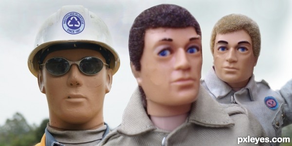
The guy in the forground is blurry, while the guy in the back is in sharper focus than he should be for "proper "depth of field." Perhaps you should reverse their positioning...
oh for sure ... you are 100% right but I lack drawing skill so the pic would be too cut up, I might try to work on it a bit more later, as of right now just getting ready to head out to my first love, Hockey .... Thanks for the comment and have a kick a$$ day!
The middle head is out of focus compared to the other two, and too large compared to the foreground head.
Already been pointed out thanks
I'll work on this one again tomorrow ... Out for more Hockey
I'm just not feeling this contest, Nothing really creative is coming to me .... not a very inspiring weekend.
Good luck to all!
Howdie stranger!
If you want to rate this picture or participate in this contest, just:
LOGIN HERE or REGISTER FOR FREE