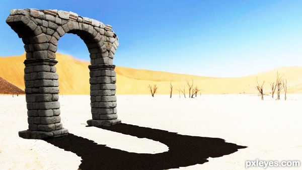
first entry in a looooong time
this is my artistic interpretation of a stone gate long forgotten...
thanks to pinzino at sxc.hu for the desert picture (5 years and 3051 days ago)
1 Source:
- 1: source1
No Escape  by Akassa 13806 views - final score: 67% | The end  by dustfinger 13017 views - final score: 66.2% | In Search of Water  by Drivenslush 13750 views - final score: 65.7% |
Back in time  by ciulama 14732 views - final score: 65.5% | The Doom Bringer 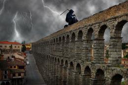 by NuTz123 10370 views - final score: 62.4% | kaleidoscope 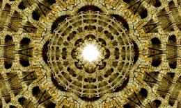 by ciulama 9116 views - final score: 62.2% |
Ocean Rising 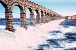 by SaEllisson 16166 views - final score: 62.1% | the train 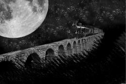 by pikkar 9435 views - final score: 60.5% | Space Aquaduct  by tnaylor21286 8504 views - final score: 59.9% |
Forgotten gate  by Inker 11992 views - final score: 59.5% | desert 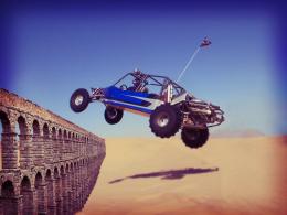 by josema2520 8885 views - final score: 58.4% |
Howdie Guest!
You need to be logged in to rate this entry and participate in the contests!
LOGIN HERE or REGISTER FOR FREE
The shadow on the ground does not correspond to the shadow on the sides of the aquaduct arch, and it is too light in color. Too visually disconcerting.
Really interesting concept. Just need to tighten the execution a bit.
The black shadows are obviously pasted on, they're bigger than the surface they're on, and they don't correspond to the shape of the gate.
OK, thanks for constructive criticism although the non-corresponding of the black shadows WAS intentional
it was changed and the shadow on the ground also was blacked to be less visually disconcerting
Author, the shadow is better, but no shadow is 100% black. If you lower the shadow opacity you could have something here. GL.
again, i considered the pure black to be arty kinda thing
but it was changed i think for the better, general burn"n"dodge was applied as well
MUCH improved, more visually consistent now, which makes for a more enjoyable appreciation of the piece.
Author, you will find that pure black, like pure white, is seldom an effective "arty kinda thing," because being extremes, they tend to dominate an image, so *in general*, you want to have them visually consistent to fit the visual dominance they will exert, which the shadow now effectively does.
LOL...now that all that stuff is out of the way, I'd like to point out that the light source is from the upper right, so the shadow is completely opposite the light source.
i see where your coming from on that, but on the source picture of the desert the shadows of the tree are extending to the right, so i went with that,
a
thanks for all the help gold hands for all!!
Howdie stranger!
If you want to rate this picture or participate in this contest, just:
LOGIN HERE or REGISTER FOR FREE