(5 years and 3034 days ago)
1 Source:
- 1: Wolf
MarioFlower 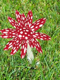 by de88ie 5586 views - final score: 62.5% | Nudibranch's Everywhere 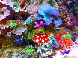 by lchappell 9329 views - final score: 62.1% | red lady 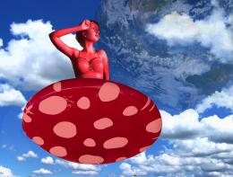 by roon 7675 views - final score: 60.3% |
Toad stool magic 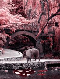 by Rushcat 11069 views - final score: 59.3% |
Howdie Guest!
You need to be logged in to rate this entry and participate in the contests!
LOGIN HERE or REGISTER FOR FREE
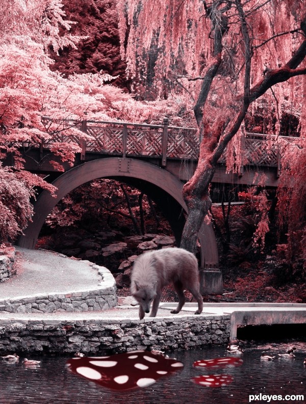
using Distort and warp on the mushroom tops might make the perspective work better.. but I like the concept.. GOOD LUCK!!!
The building's perspective doesn't match the bridge. IMO your original image is better without it, it's a lovely photo. The wolf looks too big to me, and too saturated compared to the rest of the image. Looks like you burned it a bit too much. I would really like this image with some tweaks. GL author.
PS: What's the source for the building? If it's your photo you need to post the uncut image in your SBS.
LOL author, just my opinion again...I think your image looks better with just your original photo, but I think I'd restore some color to it. Again, good luck!
Thank you for the tips and opinions Drivenslush, and CMYK46. I have changed things and added more color and I got to say it looks better than before. ^.^
I agree!
Howdie stranger!
If you want to rate this picture or participate in this contest, just:
LOGIN HERE or REGISTER FOR FREE