(5 years and 3012 days ago)
6 Sources:
Feeding Time  by tnaylor21286 13062 views - final score: 74.8% | Black and White 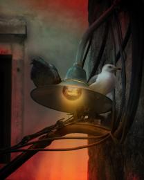 by vertigo 10788 views - final score: 65.1% | Rare Friendship 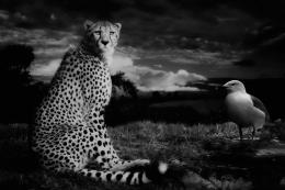 by jordyponce 11060 views - final score: 64.2% |
Sitting on the dock of the bay 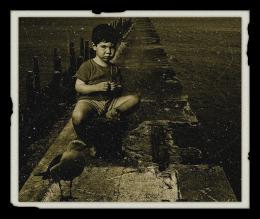 by maiaschka 13886 views - final score: 63.6% | end of the day  by anjo1989 9574 views - final score: 62.5% | on the window 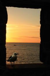 by gleizzable 6862 views - final score: 62.4% |
Teagull 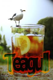 by detractor 10605 views - final score: 58.5% |
Howdie Guest!
You need to be logged in to rate this entry and participate in the contests!
LOGIN HERE or REGISTER FOR FREE
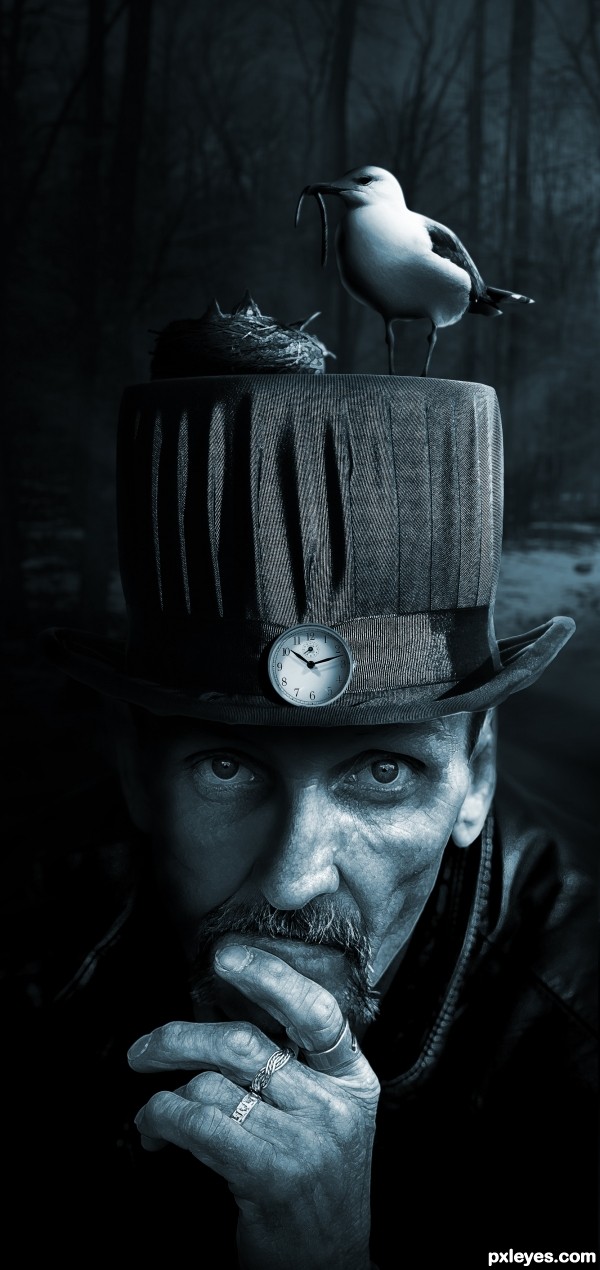
Looks great! What did you do with the skin texture?
Thanks CMYK! I duplicated the layer of the man and then used the glowing edge filter and set it to overlay then I reduced the opacity to %50. Took me a while to get this effect and it turns out that it's really simple.
Thanks for explaining, and good luck! (My only suggestion would be to give the edge of the hat a slight blur, but I love what you've done.).
love it as it is, great effect very nice
Love it! I do something very similar with one more step added. Paint daubs. Your style seems very familiar to me.... fav!
One thing ...
your bird is a tad small in comparison.
woooooooowww
That's a pretty skilled edit right there. Nice smooth combination of elements, even consistent lighting, and a well thought out concept. My only thought would be if you made the baby birds a bit more prominent. You did a great job with the source you used. Great job author! Kudos
Amazing work here!!!
Really well done!
Good luck, author!
Added color to the image Nator! Thanks for the input.
Very well done.
Great detail and depth, very thought provoking image.
Wonderful work!! Congratulations!
Howdie stranger!
If you want to rate this picture or participate in this contest, just:
LOGIN HERE or REGISTER FOR FREE