(5 years and 2994 days ago)
Marguerite Bird  by jaskier 8380 views - final score: 71.7% | In the Dewy Morning  by artgirl1935 10422 views - final score: 69.7% | Bee  by samanway 11236 views - final score: 69.3% |
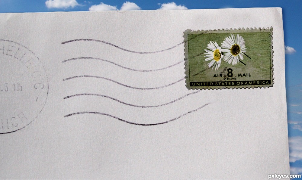
ECLOSION  by lolu 8344 views - final score: 66.1% | Roots in beauty  by siderismaris 9576 views - final score: 65.2% | Daisy Stamps 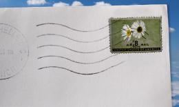 by xwd 7153 views - final score: 64.6% |
Backlit Flower  by Nator 4989 views - final score: 63.8% | Melancholy  by KlaudiaBurczyk 16366 views - final score: 62.4% | Special Flowers  by detractor 14050 views - final score: 61.9% |
Flower Power  by toxicangel80 5378 views - final score: 57.1% | the statue 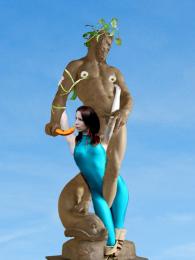 by LIONSDEN 4571 views - final score: 55.3% | Summer Blues  by lillucky91 5915 views - final score: 52.5% |
Howdie Guest!
You need to be logged in to rate this entry and participate in the contests!
LOGIN HERE or REGISTER FOR FREE
Photography and photoshop contests
We are a community of people with
a passion for photography, graphics and art in general.
Every day new photoshop
and photography contests are posted to compete in. We also have one weekly drawing contest
and one weekly 3D contest!
Participation is 100% free!
Just
register and get
started!
Good luck!
© 2015 Pxleyes.com. All rights reserved.


well how clever is this? hehehehe.. wonderful idea
I agree Ernest..
cool idea!!..
its a great idea and to make it even stand out more I suggest you add some shadows below some parts of the edges of the stamp because stamps tend to get loose on the edges a bit the cutout could have been done a lil bit better or choose a different method of cutting off the edge. perhaps if u place a row of small circles next to eachother on the same height with a lil space between them and then used those to cut the edge of the stamp, that you can make that stamp edge cutout more realistic and less like it has been cut with one of those craft scissors with the swirly zigzag blades etc.. also you did a very nice work on the inkstamp on the stamp
the postmark stamp looks great! i think the actual stamp could use some work. The flowers and the stamp feel like two different color pallets are used. If you use the "Match Color" adjustment it will help shift the colors to match better (Image > Adjustments > Match Color). Just have the layer selected that the color needs to be adjusted, then in the match color, select the source, being the layer that you want to match the color to. adjust the sliders until you get the look that you want and you are good. ;] Great work overall! good luck!
Howdie stranger!
If you want to rate this picture or participate in this contest, just:
LOGIN HERE or REGISTER FOR FREE