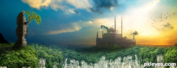
Environment matte painting, thanks for every stock provider.
Special thanks to - "vivekchugh " for "Goa beach" stock! (5 years and 2955 days ago)
- 1: Castle
- 2: Atacama Desert
- 3: Goa beach
- 4: Atlantic forest

Environment matte painting, thanks for every stock provider.
Special thanks to - "vivekchugh " for "Goa beach" stock! (5 years and 2955 days ago)
Not Talking  by tnaylor21286 12063 views - final score: 73.5% | ACROBAT  by lolu 8661 views - final score: 70% | Lost in space  by maiaschka 13606 views - final score: 69.8% |
Environment matte painting 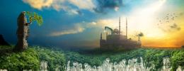 by AdhirAnimator 16013 views - final score: 68.5% | Smokebird  by lahiripartha 7593 views - final score: 67.2% | Escape  by Nator 4599 views - final score: 66.9% |
Shunned...  by Stowsk 4282 views - final score: 66.5% | Walking in the Clouds  by DanielaOwergoor 7865 views - final score: 66.4% | Bored Evil Zombie  by jordyponce 7642 views - final score: 66.3% |
Building  by detractor 6506 views - final score: 66.1% | chocolate  by Se7eN0f9 4915 views - final score: 65.7% | Boom  by Nator 4059 views - final score: 64.8% |
dancing daisy  by hymerion 10399 views - final score: 64.7% | Cherry Much  by RickLaMesa 5063 views - final score: 64.6% | Witches Ordinary Day  by jordyponce 6544 views - final score: 64.6% |
Distracted Prey  by TwilightMuse 4988 views - final score: 63.9% | Distant Fire  by lchappell 6360 views - final score: 63.8% | TURTLE HORSE  by lolu 7179 views - final score: 63.3% |
above the sky  by jack2 8108 views - final score: 62.9% | Lightning in a Jar  by jbillitteri 14945 views - final score: 62.7% | sunset  by SHIPLEYGIRL 5107 views - final score: 62.1% |
Tank Dog  by xwd 19125 views - final score: 61.5% | Polo Cup Edition  by Marc Muller 9550 views - final score: 61.4% | Tiptoe Through the Daisies  by bjaockx 9999 views - final score: 61.4% |
first kiss  by rob170 8808 views - final score: 60.6% | The Path of Fate  by lavenderflower23 5383 views - final score: 60.5% | Odi et Amos  by blaine2nd 4239 views - final score: 60.5% |
spooky rails 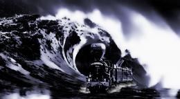 by SHIPLEYGIRL 7198 views - final score: 59.6% | angel  by SHIPLEYGIRL 4156 views - final score: 59.3% | i give you love 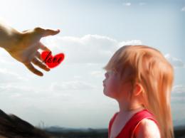 by alej3 6849 views - final score: 56.5% |
Howdie Guest!
You need to be logged in to rate this entry and participate in the contests!
LOGIN HERE or REGISTER FOR FREE
Really great!
 ) is making the image a bit bigger at the bottom and emphasize the bare rocks a bit more, IMHO that will attract the attention more on the beautiful sky you've used. But that's what I would do, please don't do it if you don't want to: it's in the end your work and that's how it should be

Just, for me, the "treestructure" on the left jumps a bit out; the dark shadow is a bit to hard compared to the building and the blending of the tree is not "yeah!". The tree you can easily solve by adding shadows to the leaves and with the use of a very small blur brush (say 3 pixels), make a new top layer and select all layers, and go over the edges of the leaves that will give you a better blending.
As a personal touch (what I would do that is
One more thing: I see you have to credit the author of source 3: just add "thanks to vivekchugh" in your link to that source
Thank you for giving your feedback on my work, will try to update that (hopefully I will get time for that). But once again thank you my friend.

I have updated the stock provider name in my entry.
lovelly colors and atmosphere! the blue to orange sky gradient work really well here. i'm not thats sure about the tree up front but other than that its lovelly
Looks fantastic, even tho the high res version doesn't look that high.
Friends I have updated the image.


@robvdn - I have updated the image with "tree structure", let me know if it look nice! One more thing - bigger at I tried to increase bottom image but it is not going with the composition. But big thank you for your suggestions!
@ pshoudini : Thank you my friend, I used tree up front to create visual path for viewer.
@ Akassa - Good to know you like it, please check again in high res as I have updated the image.
the problem with the tree is that it is the only thing that looks pasted on... all the rest of the image looks great! a little more work on the tree is needed. i suggest you try to match the color of the tree t the rest of the image. you can do this by going to IMAGE > ADJUSTMENTS > MATCH COLOR. Make sure you have your tree layer selected, duplicate it, than do the match color. Match the color to the main background image, by selecting it form the drop boxes at the bottom of the dialog box that comes up. using the sliders adjust the settings till the tree matches the rest a little more.
@ bjaockx : Thank you for your valuable feedback my friend, but right now I am unable to upload the edited entry.
I will keep this in mind in my future work!
Howdie stranger!
If you want to rate this picture or participate in this contest, just:
LOGIN HERE or REGISTER FOR FREE