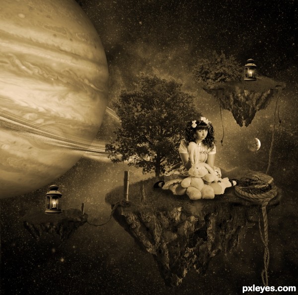
Images used;
Bush, struik, http://www.3dtexture.net/img-bush-tree-baum-518.htm
Background, http://www.eso.org/public/images/scorpius-wf-cc-1986/
Background, http://nasaimages.org/luna/servlet/detail/nasaNAS~12~12~64122~168495:Great-Observatories-Present-Rainbow
Lantern, http://www.sxc.hu/photo/500803 (5 years and 2971 days ago)



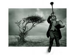


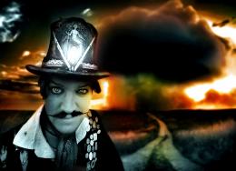
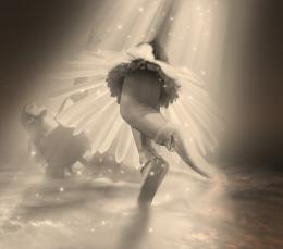
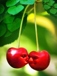
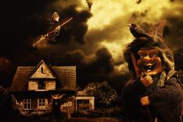

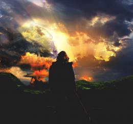
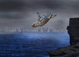
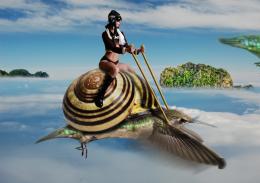
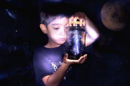



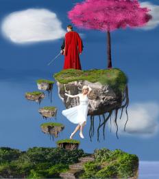




awesome musted colors. great concept and well executed
I think with some more color it would look more attractive, more vivid, good compilation tho!
I agree with Akassa if you added some colors this would be amazing!!
I luv it ^_^
I'm torn about the sepia tone effect. It's an interesting approach, but loses the illusion of depth that some color could provide. Over all I like your image, but why not just use a pic of Saturn if you wanted rings?
the muted colors can be fine for the image, but as CMYK mentioned it loses depth with the lack of color. You can add the depth back in by shading your more distant objects as well as making them less in focus, this will bring your eyes to the more clear focal point and create the illusion of depth in the back. Good Luck!
Really like this author! All things considered above from other members...they are great observations...but I personally like it the way it is. Some of the elements that are deemed to be 'fixed'...are just the things that make this image kind of charming and sweet. I could see this being used as a CD cover...for a female artist. Love the expression of the gal.
Thank you all . I could have used colors, but i loved the sepia, and how it turned out so much better then with a hint of color, so I decided to stay with it.
Congrats!!
thank you all
Howdie stranger!
If you want to rate this picture or participate in this contest, just:
LOGIN HERE or REGISTER FOR FREE