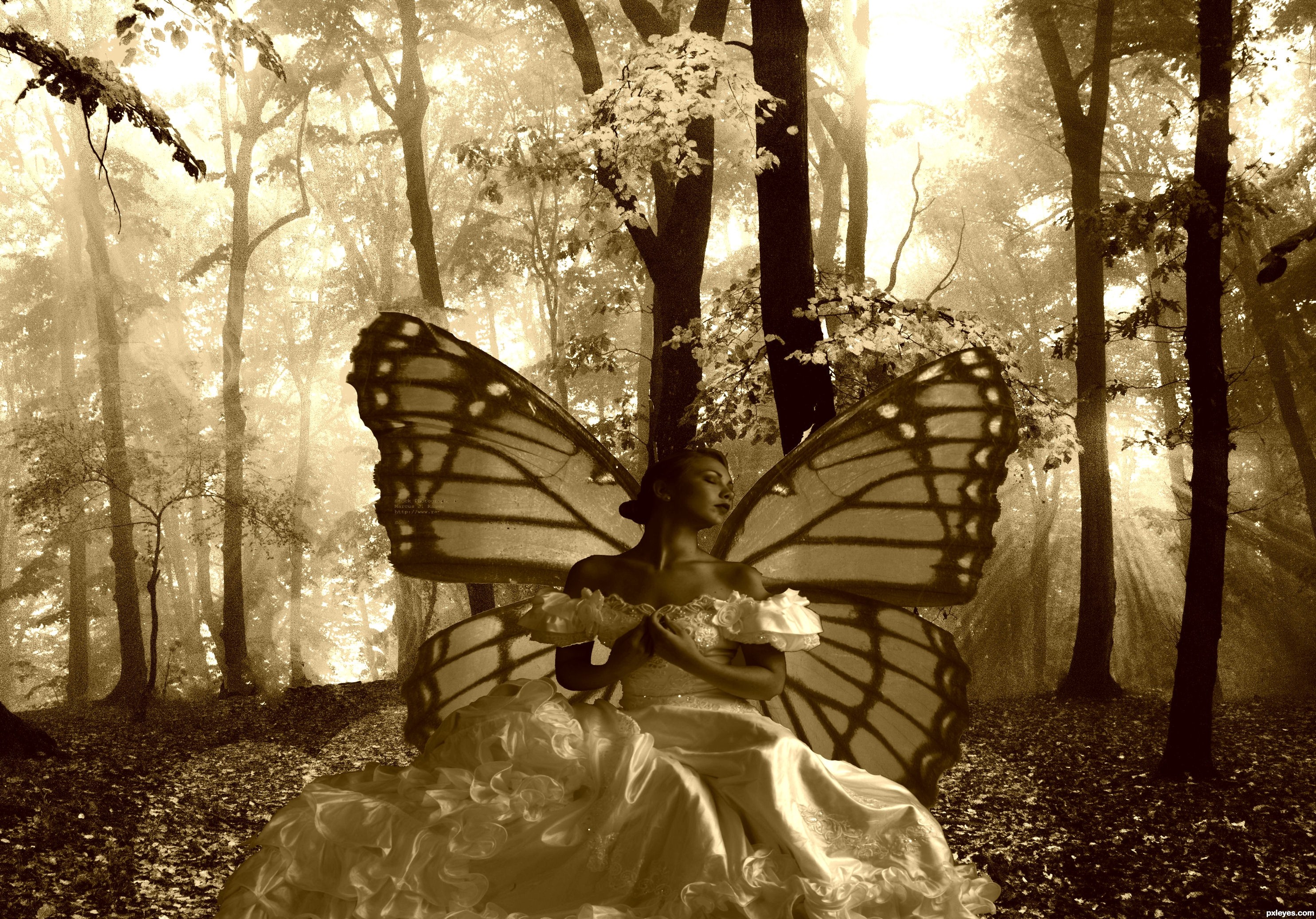
thanks marcus ranum ,davidplex
be kind this is the first one i did with adobe i usually use corel (5 years and 3039 days ago)
Threatened Freedom 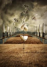 by divair 15096 views - final score: 74.7% | Tranquility 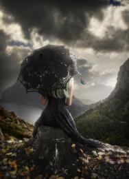 by fatz8016 10979 views - final score: 72.2% | Lady Beetle 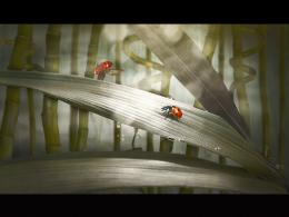 by jaskier 11172 views - final score: 69.7% |
Room 1 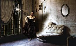 by anncio 7831 views - final score: 69% | Sid's Boutique 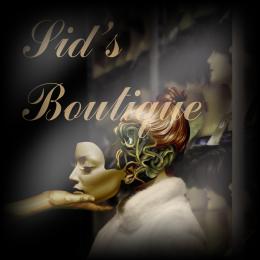 by Stowsk 7810 views - final score: 68.5% | JADE  by lolu 3994 views - final score: 67.5% |
KATE  by lolu 3471 views - final score: 66.6% | mixto fish 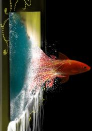 by jack2 7363 views - final score: 66.6% | Vague 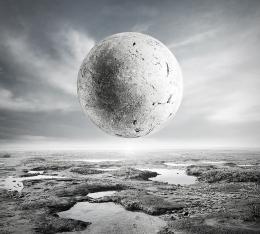 by DanielaOwergoor 5812 views - final score: 66.2% |
The Little Musician 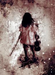 by Elle124 9087 views - final score: 65.6% | winstinman  by Happy14U 4544 views - final score: 64.8% | violin 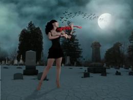 by Se7eN0f9 6879 views - final score: 64.5% |
crystal ball 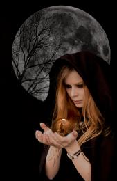 by SHIPLEYGIRL 8910 views - final score: 63.8% | Face-off 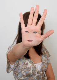 by shahazadkm 9464 views - final score: 63.7% | candy colors 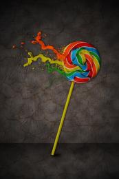 by sam007 6852 views - final score: 63.7% |
Stillness  by divair 3587 views - final score: 63.1% | In the night 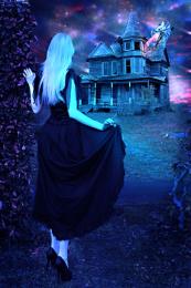 by nishagandhi 11893 views - final score: 61.1% | fairy times 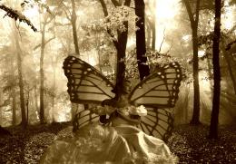 by SHIPLEYGIRL 5139 views - final score: 60.5% |
Profile  by tnaylor21286 4290 views - final score: 56.4% |
Howdie Guest!
You need to be logged in to rate this entry and participate in the contests!
LOGIN HERE or REGISTER FOR FREE
Photography and photoshop contests
We are a community of people with
a passion for photography, graphics and art in general.
Every day new photoshop
and photography contests are posted to compete in. We also have one weekly drawing contest
and one weekly 3D contest!
Participation is 100% free!
Just
register and get
started!
Good luck!
© 2015 Pxleyes.com. All rights reserved.


Nice...might be good to remove the black outline around the woman, and make the wings slightly translucent.
Besides the black around the figure there's a lot of white and ragged edges on the butterfly as well.
IMHO as I said, the wings might be better with a bit of transparency, but that's up to you, author. There's some distracting type on the left wing in hi-res. I liked the color version better.
Using just light and dark (not color) is dramatic but also challlenging. I agree totally with the previous commenters. I further suggest employing the Rule of Thirds and moving the fairy to the left so she doesn't blend into the trees while creating a more-compelling and balanced composition.
DanLundberg makes good points about the composition, as it is now you have the classic mistake of having a tree growing out of her head. The type CMYK46 mentions is from the Marcus Ranum image. The mask work has many problems, you should try using layer mask to silhouette an image. This creates a temporary mask that allows you to bring back the edges of the image that may have been too deep or uneven since the image is still complete under the mask.
Howdie stranger!
If you want to rate this picture or participate in this contest, just:
LOGIN HERE or REGISTER FOR FREE