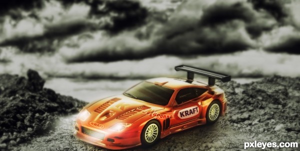
I gave a touch of color contrast between the car and the whole ambience,to make the car stand out in a kind of advertisement way. (5 years and 2934 days ago)
3 Sources:
Owlbear Stuffins 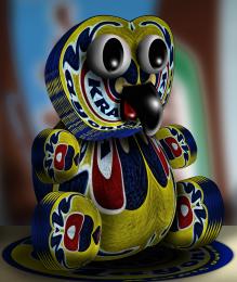 by Drivenslush 6089 views - final score: 66.6% | Flower Kraft 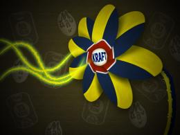 by Yoniz009 8543 views - final score: 65.4% | Kraft Dirt Racing Car Posing  by jordyponce 11012 views - final score: 61% |
Old ad 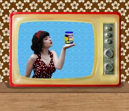 by Sofie73 6933 views - final score: 60.8% | Soap of War with Ladybird 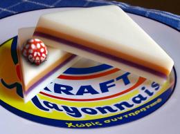 by Drivenslush 9451 views - final score: 59.2% | The Joy of Fat 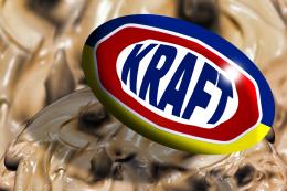 by Drivenslush 8832 views - final score: 57.9% |
Howdie Guest!
You need to be logged in to rate this entry and participate in the contests!
LOGIN HERE or REGISTER FOR FREE
a little more space below the car (very close crop) just to center the attention on the subject (Thinking how it would look on a video/TV screen) would improve the image and focus more on the car (sorry, I work in print media and we always need a bleed LOLOLOLOL.. good luck and good work
Hi Ernest!..funny coincidence I used to work in a print media too,
oh man.. I just hate that bleeding thing LOL,maybe thats why I did that chop
close crop..hahaaa
even now when I do some business cards,flyers or posters for my clients, I have to
follow that silly rule,just dont like it at all.
Oh nooo I erased the psd!!!!!!!..cant find it.!
I guess cant do much now..oh man.
Anyway thanks friend for the advice,I'll keep that in mind for future chops..
Howdie stranger!
If you want to rate this picture or participate in this contest, just:
LOGIN HERE or REGISTER FOR FREE