1 sources only, own photograph (5 years and 2926 days ago)
gravity  by Chalty669 11601 views - final score: 72.5% | Free For All  by pixelkid 16988 views - final score: 70.9% | The Sheep Meadow incident  by CommanderBond 16730 views - final score: 66.5% |
Countryside levitation 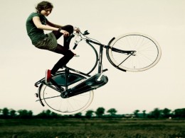 by CommanderBond 13458 views - final score: 66% | Hot Diggety Duck! 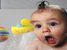 by RickLaMesa 14190 views - final score: 64.8% | Makes Float 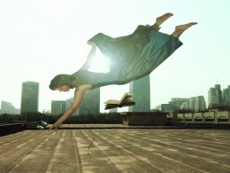 by detractor 12968 views - final score: 64.5% |
Zero G Privy 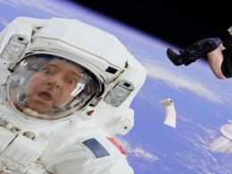 by spaceranger 5396 views - final score: 62.1% | Freaking out the Dog 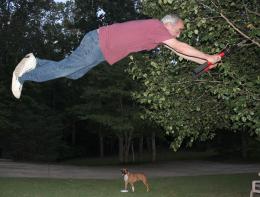 by jbillitteri 9803 views - final score: 61.3% | Planky Planker 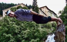 by Drivenslush 6598 views - final score: 60.6% |
Fishbowl Fiasco 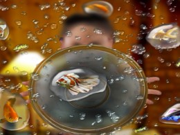 by Majkman 4510 views - final score: 59.9% | Crazy day in the park 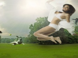 by micoprego 15570 views - final score: 59.5% | Me Too!  by Drivenslush 3749 views - final score: 59.3% |
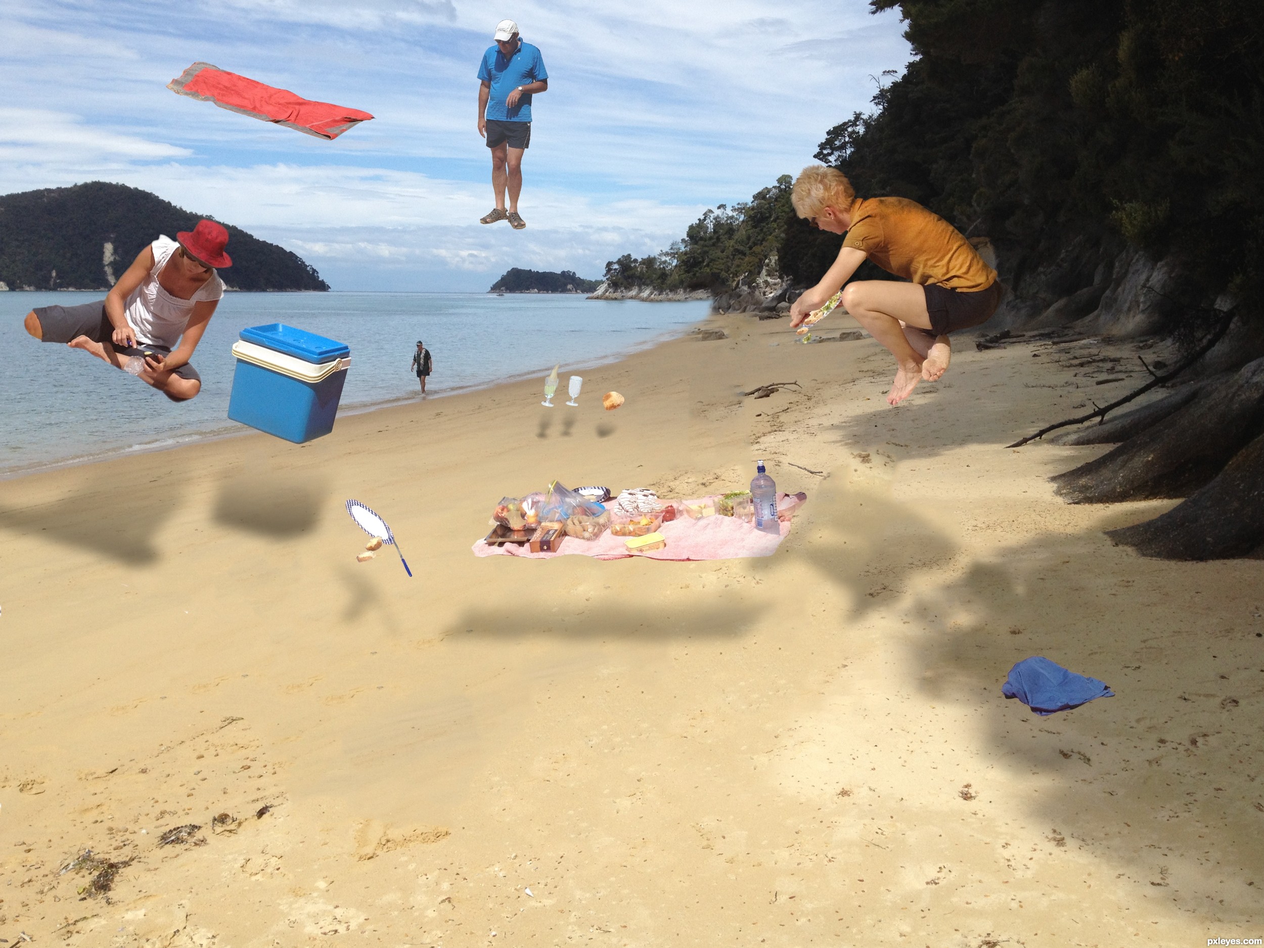
It Happened in the Baby's Room  by Drivenslush 8227 views - final score: 58.6% | Picnic 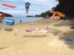 by friiskiwi 8673 views - final score: 57.6% |
Howdie Guest!
You need to be logged in to rate this entry and participate in the contests!
LOGIN HERE or REGISTER FOR FREE
Photography and photoshop contests
We are a community of people with
a passion for photography, graphics and art in general.
Every day new photoshop
and photography contests are posted to compete in. We also have one weekly drawing contest
and one weekly 3D contest!
Participation is 100% free!
Just
register and get
started!
Good luck!
© 2015 Pxleyes.com. All rights reserved.


I like the idea especially the cooler and guy with red hat. It seems to represent the best light source from the beach. One suggestion for you...perhaps lighten or 'brush' away the tops of the shadows in the layer mask with a 50% opacity brush. This might help give the shadows some depth. Also, if you squash the shadows a bit...more like 'flatten' them by distorting them they will have a more believable plane. Does that make sense?
Thanks, I was hoping somebody would come up with some suggestions for improvements.
I think he is a she (the 'guy' with the red hat, that is).
I agree with pixelkid with the shadows perspective, I would work a bit longer on some of the masking. Mostly the woman on the right around the head region. Also The guy behind the towel keeps distracting me. I don't know if its the location or that he is right behind the towel. I would try to move the guy closer to the ground and see if it helps with the composition. Although I could be wrong. Good Luck!
I have uploaded a better version, (I hope), further suggestions are welcome.
Using Gaussian blur on the shadows will make them less sharp (and warp will shape them also) , and running a blur tool brush over your masking edges help images to blend better (Using distort to make the shadows more perspective correct helps a lot as well (if you don't have warp) )
 ) but that could just be me and always IMHO
But the more you practice the more you figure things out, this is a great effort.. (Reduction of the amount of floating things might help as well, less is more
Howdie stranger!
If you want to rate this picture or participate in this contest, just:
LOGIN HERE or REGISTER FOR FREE