Star balloon is PS default shape. (5 years and 2918 days ago)
6 Sources:
Butcher robot poster 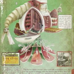 by grupax 18996 views - final score: 75.8% | CAPTAIN AMERICA 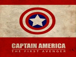 by TimeGenius 14980 views - final score: 69.8% | Binford Does BBQ 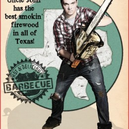 by pearlie 17200 views - final score: 67.4% |
The Dark Knight of Gotham  by tnaylor21286 14606 views - final score: 66.5% | Have Times Changed? 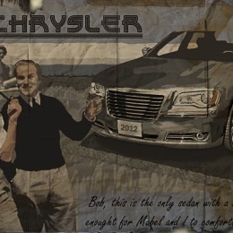 by Majkman 13777 views - final score: 65.9% | revolutionary 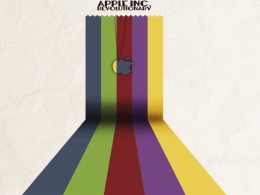 by li3N 5784 views - final score: 65.4% |
Tame the world  by divair 6200 views - final score: 65.2% | Rocketlantis 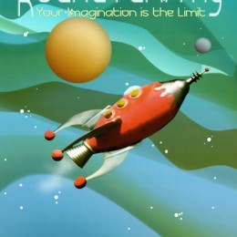 by detractor 11663 views - final score: 65.2% | Man of Steel 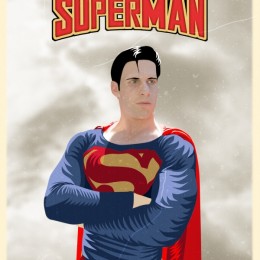 by tnaylor21286 8045 views - final score: 64.9% |
Queen of the galaxy 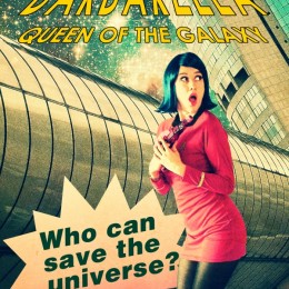 by divair 7647 views - final score: 64.8% | Red Planet Excursions 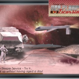 by pearlie 11627 views - final score: 63.7% | OPTIMUS PRIME 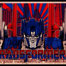 by macarhign 14061 views - final score: 63.5% |
El Salvaje Felino  by jordyponce 4776 views - final score: 63.4% | PEACE  by Nator 3871 views - final score: 63.4% | Alien Attack 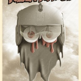 by tnaylor21286 4420 views - final score: 63.4% |
New BIM 5210 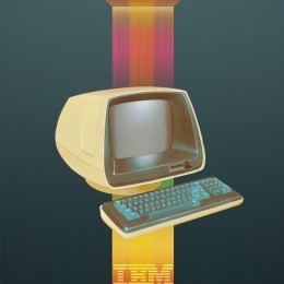 by detractor 12499 views - final score: 63.2% | GOD OF WAR 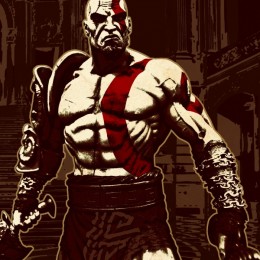 by macarhign 24121 views - final score: 62.9% | Someone Stepped on the Cable  by Drivenslush 6750 views - final score: 62.9% |
Deadpit Presents this Friday 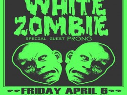 by detractor 12611 views - final score: 62.6% | The Beatles - COLORS 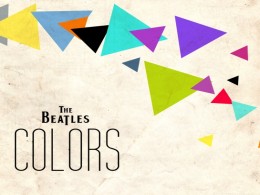 by TimeGenius 7995 views - final score: 61.8% | Retro Poster Contest 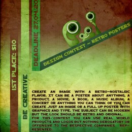 by Arryko 9015 views - final score: 61.3% |
iPod's Past 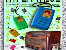 by Drivenslush 6723 views - final score: 59.7% | Pxleyes Museum 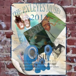 by Glockman 5612 views - final score: 59.7% | Torment  by layerstack 4460 views - final score: 59.5% |
the battle continues 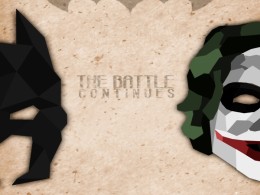 by li3N 7161 views - final score: 58.7% | Come to the Orient Proposal  by Drivenslush 6188 views - final score: 57.2% | my life - my rules  by Androla 7333 views - final score: 57.2% |
Howdie Guest!
You need to be logged in to rate this entry and participate in the contests!
LOGIN HERE or REGISTER FOR FREE
Photography and photoshop contests
We are a community of people with
a passion for photography, graphics and art in general.
Every day new photoshop
and photography contests are posted to compete in. We also have one weekly drawing contest
and one weekly 3D contest!
Participation is 100% free!
Just
register and get
started!
Good luck!
© 2015 Pxleyes.com. All rights reserved.


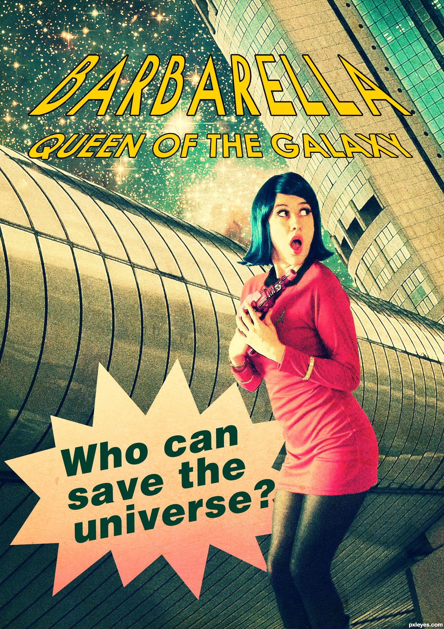
Love the retro texture feel, but she looks like she's falling over...and who knew Barbarella was in Star Fleet?
PS: Don't you think all the type at the top should have the same perspective?
Thank you Bob! Applied perspective like the old posters of Barbarella By the way, the universe became too big for her to try to save it all by herself... So she joined the Star Fleet crew
  I'm not sure whether changing her position made it better...
Now she's not falling over, which is a good thing.
As for the type. of course the perspective is up to you, but now "queen of the galaxy" is the reverse of the larger type, not following the same perspective. Think STAR WARS titles.
Nice colors and good pick of sources. I'm less convinced about the choice of font for the tagline. It can have some more drama by using a bigger size, other font and perhaps (just as the text on top which looks better, maybe a bit thicker border) the use of some perspective (maybe you can use the perspective from the metal background to align with). Good luck!
Thank you @wazowski. I made some changes. Used bold century gothic for the tagline and applied a different perspective. I made the borders thicker too
I agree with wazowski... I love this but the bottom is missing that drama. I think the tag line in side something like this would complete an excellent piece.
http://www.powerpoint-2010.com/wp-content/uploads/2011/12/star-bubble-02.jpg
Thank you @oziipop! I got it!
That totaly finished it up! Looks kick @$$!
Can only agree with that . Good luck!
Howdie stranger!
If you want to rate this picture or participate in this contest, just:
LOGIN HERE or REGISTER FOR FREE