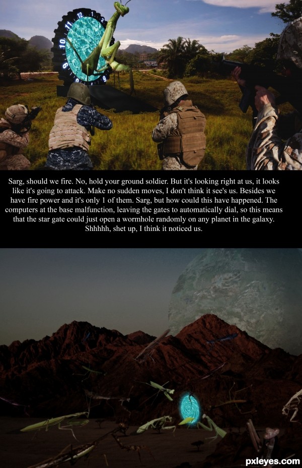
(5 years and 2896 days ago)
10 Sources:
Dimensions  by Nysoe 14031 views - final score: 70.2% | Road Of Time  by fatz8016 11735 views - final score: 70% | Dangling  by Drivenslush 9294 views - final score: 65.1% |
Alice's Decision 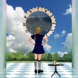 by Sofie73 11450 views - final score: 64.8% | The garden of Eden 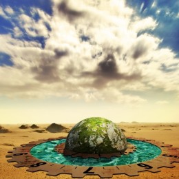 by divair 13227 views - final score: 64% | The Watcher  by sunny22jan 17602 views - final score: 64% |
Universal Time 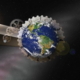 by bjaockx 11111 views - final score: 63.3% | Eye 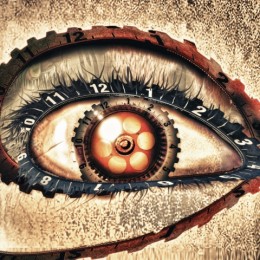 by ruppelman 5538 views - final score: 61.8% | Time Distortion 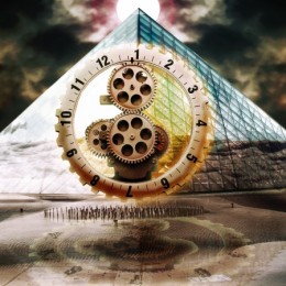 by detractor 7676 views - final score: 61.8% |
Watch in a Wheel! 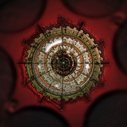 by shaiju1974 9465 views - final score: 61.7% | Ocean Landing 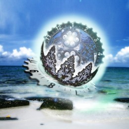 by SaEllisson 11419 views - final score: 60.6% | Time walk 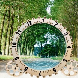 by photoshopmum 6200 views - final score: 59.8% |
Lost in Time 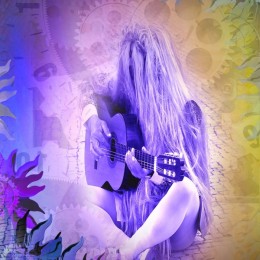 by artgirl1935 4695 views - final score: 59.5% | Amok Time 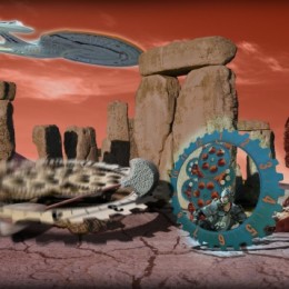 by pearlie 12021 views - final score: 59.1% | Miss Time 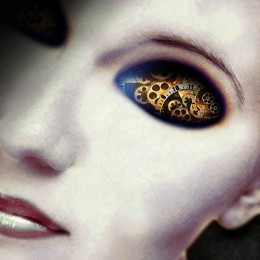 by SaEllisson 10194 views - final score: 59.1% |
It's Time To Pray 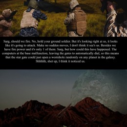 by rjapzdesign 5506 views - final score: 57.7% |
Howdie Guest!
You need to be logged in to rate this entry and participate in the contests!
LOGIN HERE or REGISTER FOR FREE
Next time i would leave the text out of the image and put it all in the entry's description box, if you want to give a little narrative to set up your image. all the text in your image does is take away from your image. neat idea, Good luck!
Yeah ur right Bjaockx, I was thinking of putting it in the description. Then I figure it might not go with the movie entry, it would just be describing it. I put the text in the middle cause it divides the two scenes, here on earth and on mantis planet.
Howdie stranger!
If you want to rate this picture or participate in this contest, just:
LOGIN HERE or REGISTER FOR FREE