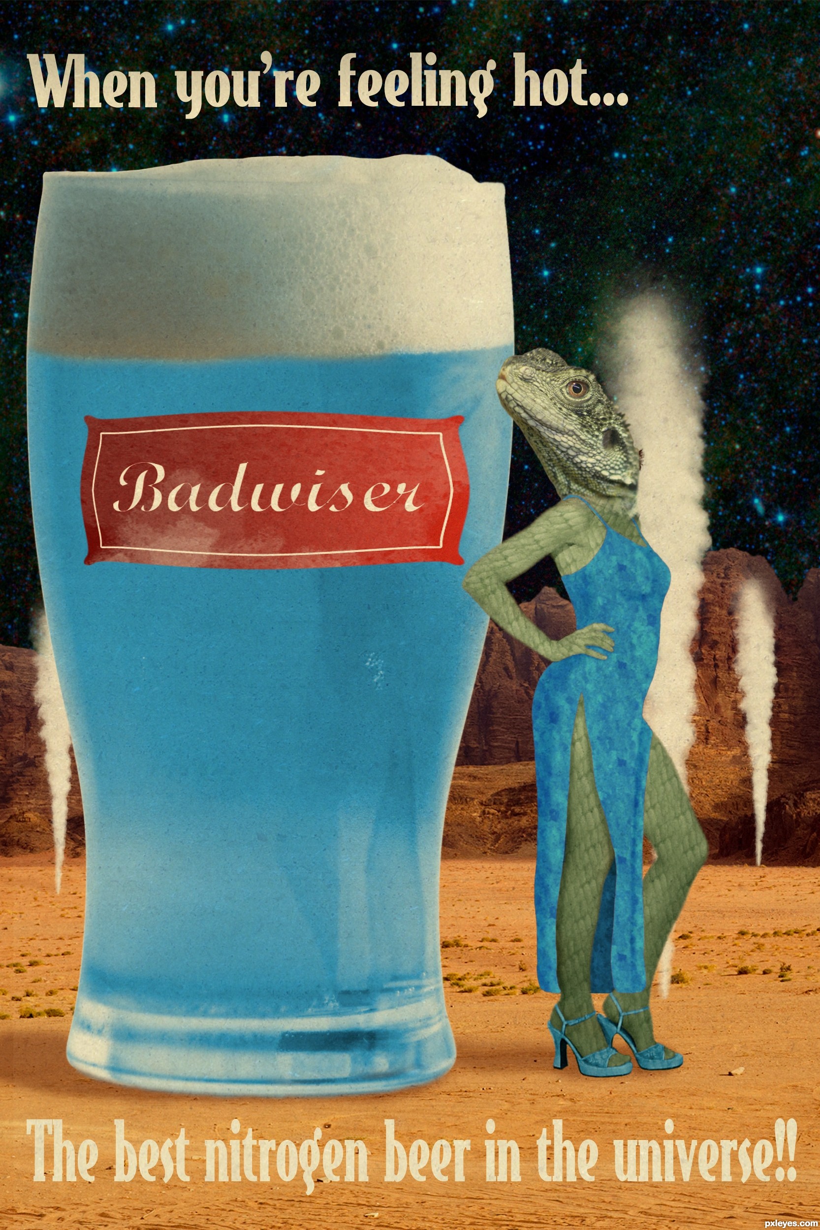
Thanks a lot to Senshistock for her image!!
EDIT: Vapor brush from qbrushes.net
http://qbrushes.net/misc/vapor-trail-brush/ (5 years and 2909 days ago)
10 Sources:
Charlotte's Rad Rayguns  by pearlie 14982 views - final score: 69.2% | Epsilon Eridani 5  by spaceranger 6813 views - final score: 68.7% | THINKING CAP 2.1  by CMYK46 9432 views - final score: 66.5% |
New Species Discovery 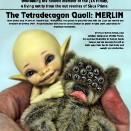 by Drivenslush 9820 views - final score: 65.6% | Progressions of Souls  by Drivenslush 6081 views - final score: 64.1% | Serve cool 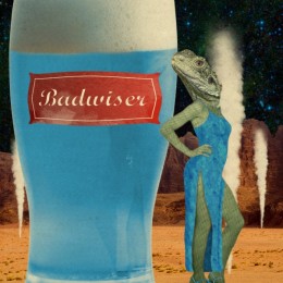 by minnie 6687 views - final score: 63.2% |
Relax and enjoy!  by Majo 5115 views - final score: 60.8% | Relax, it's No One You Know  by Drivenslush 7397 views - final score: 60.1% |
Howdie Guest!
You need to be logged in to rate this entry and participate in the contests!
LOGIN HERE or REGISTER FOR FREE
Photography and photoshop contests
We are a community of people with
a passion for photography, graphics and art in general.
Every day new photoshop
and photography contests are posted to compete in. We also have one weekly drawing contest
and one weekly 3D contest!
Participation is 100% free!
Just
register and get
started!
Good luck!
© 2015 Pxleyes.com. All rights reserved.


Badwiser!!!! LOLOL good luck fun poster!!!
Thanks Drivenslush!!

Fun concept, but I think a hotter (brighter) landscape would be more appropriate for a refreshing beverage and would bettter play on the competing notions of a hot environment and a hot chick (unless your message is that hot chicks should get drunk so they lower their standards). Making the glass the biggest element would make it—and the beer inside—clearly the focus. I also don't feel like the label matches the contour of the glass.
Thanks so much for your tips Dan! I tried changing the sat. of the background and the brightness but it didn't convice me so I added the vapor columns instead.
I've also made the beer bigger. I'm not satisfied with the label either, but I've added a black to white gradient (soft light) and some noise. And I think it's better.
Thanks again!
Above all it is original!!
Thanks Sofie!
Howdie stranger!
If you want to rate this picture or participate in this contest, just:
LOGIN HERE or REGISTER FOR FREE