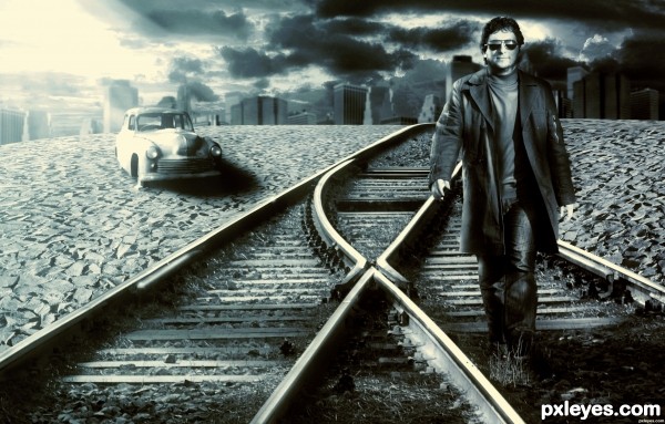
See in Hi-Res (5 years and 2885 days ago)
The Last Train  by ShiZa 30850 views - final score: 67.7% | The wait  by itsdesign 14294 views - final score: 67.6% | Train for Short People  by Drivenslush 16625 views - final score: 66% |
King Potato Head & Sir Squeak  by Drivenslush 14841 views - final score: 64% | Walker 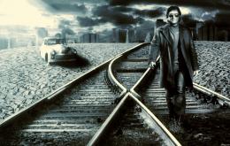 by ruppelman 10026 views - final score: 62.9% | Lost Paradise 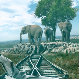 by Rushcat 8071 views - final score: 61.1% |
Standing By... 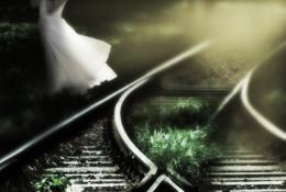 by Lamantine 4647 views - final score: 58.1% |
Howdie Guest!
You need to be logged in to rate this entry and participate in the contests!
LOGIN HERE or REGISTER FOR FREE
Nice job, but be careful to the rule of thirds, it should enhance a lot the quality of the image. Another suggestion is to add some shadow, or better a hard shadow (by looking at the light on the left) to the car, and a soft one to the walker.
Rusvelt2000 Thanks, I'll try to improve the image the way you say. and see what it is. Thanks for the advice, very constructive.
Nice color and mood, but just a little nitpick - the light source seems to be coming from the left and behind the man. The car looks ok, but the bright glare spot on the man's glasses should probably not be there.
Howdie stranger!
If you want to rate this picture or participate in this contest, just:
LOGIN HERE or REGISTER FOR FREE