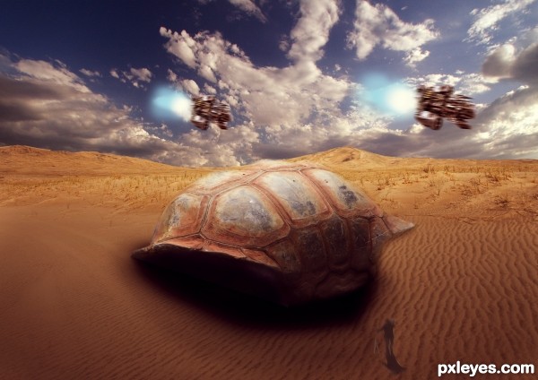
its A giant shell (5 years and 2882 days ago)
eye of the owl  by kathyw 25280 views - final score: 69.6% | apocalypse  by Se7eN0f9 10840 views - final score: 67.1% | A SI-FI Scene  by ApexHUnter 12794 views - final score: 62.4% |
Conversion of the Humans  by Drivenslush 5975 views - final score: 61.8% | beauty of nature  by SHIPLEYGIRL 12167 views - final score: 60.9% | Miley  by EmiK 3304 views - final score: 59.5% |
Howdie Guest!
You need to be logged in to rate this entry and participate in the contests!
LOGIN HERE or REGISTER FOR FREE
Might be better with less motion blur on the ships.
i did less but liked more
OK then...I don't want to seem like I'm picking on you, but why is the foreground figure blurry, and why is the shadow not proportional.
It's just a personal opinion, but I think the foreground would had to be more focused, while the background mountains had to be blurred. Nice selection of the sources which made the picture very star wars looks like. GL author
congrats!
Nice Job Congrats
thanks everyone
Congrats!!
Howdie stranger!
If you want to rate this picture or participate in this contest, just:
LOGIN HERE or REGISTER FOR FREE