(5 years and 2847 days ago)
3 Sources:
big and small  by Se7eN0f9 19074 views - final score: 68.5% | X & Y  by rusvelt2000 24059 views - final score: 68.5% | HOT ICE 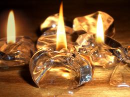 by CMYK46 22995 views - final score: 67.7% |
Good's Defeat  by Akassa 12302 views - final score: 67% | Sun Yang, Yin Moon  by KDookie 24030 views - final score: 65.5% | Decisions 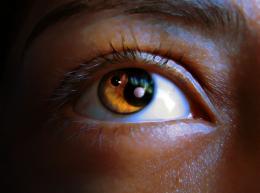 by oziipop 11308 views - final score: 64.7% |
Apples To Oranges  by SaEllisson 10314 views - final score: 62.9% | Life and Death  by SaEllisson 26776 views - final score: 62.9% | Flesh and steel  by CMYK46 7478 views - final score: 61.3% |
My evil side and me 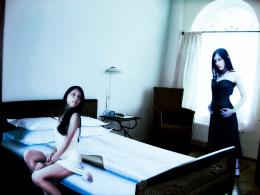 by detractor 7646 views - final score: 60.2% | Potential Y&Y 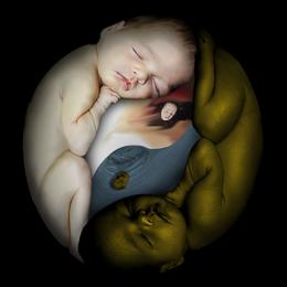 by Majkman 4196 views - final score: 58.7% | Snail Leaving Cheetah Trail! 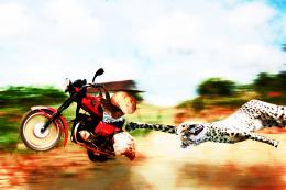 by woodztockr 7769 views - final score: 56.2% |
2012  by kingsta20 5742 views - final score: 56.2% | Shrimps Covering the Half Shaven Heart 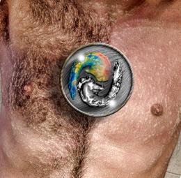 by Drivenslush 9370 views - final score: 54.4% | Harmony 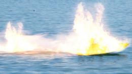 by kingsta20 4586 views - final score: 50.3% |
Howdie Guest!
You need to be logged in to rate this entry and participate in the contests!
LOGIN HERE or REGISTER FOR FREE
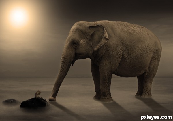
Maybe too small, IMO the mouse is scarcely recognizable.
thx for the comment but i think if i make the mouse bigger,it would be out of proportion
very suggestive atmosphere, the last on earth? bravo
Couldn't tell it was a mouse there until viewing the SBS, and the shadows are a bit off. Here's a tip: On a separate layer, draw lines from the center of the light source through the areas to be shadowed, and work accordingly. Also, your shadow gradients are reversed. A shadow is always darkest when closest to the object, and fades with distance. I like your idea...GL author!
thx for the tip, im not that good with shadows lol, but i tried to make it look better, and also took another image for the mouse
Now the mouse is ok! Good luck author
love the whole scene ,, great colour work .GL
Congrats!!
Congratulations!
Howdie stranger!
If you want to rate this picture or participate in this contest, just:
LOGIN HERE or REGISTER FOR FREE