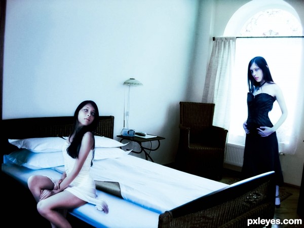
(5 years and 2854 days ago)
big and small  by Se7eN0f9 19095 views - final score: 68.5% | X & Y  by rusvelt2000 24090 views - final score: 68.5% | HOT ICE  by CMYK46 23013 views - final score: 67.7% |
Good's Defeat 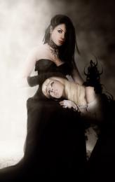 by Akassa 12319 views - final score: 67% | Sun Yang, Yin Moon 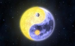 by KDookie 24054 views - final score: 65.5% | Decisions 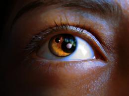 by oziipop 11321 views - final score: 64.7% |
Apples To Oranges  by SaEllisson 10332 views - final score: 62.9% | Life and Death 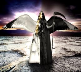 by SaEllisson 26800 views - final score: 62.9% | Flesh and steel  by CMYK46 7490 views - final score: 61.3% |
My evil side and me  by detractor 7656 views - final score: 60.2% | Potential Y&Y 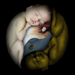 by Majkman 4207 views - final score: 58.7% | Snail Leaving Cheetah Trail! 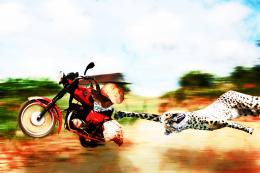 by woodztockr 7792 views - final score: 56.2% |
2012  by kingsta20 5753 views - final score: 56.2% | Shrimps Covering the Half Shaven Heart 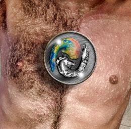 by Drivenslush 9392 views - final score: 54.4% | Harmony  by kingsta20 4597 views - final score: 50.3% |
Howdie Guest!
You need to be logged in to rate this entry and participate in the contests!
LOGIN HERE or REGISTER FOR FREE
In my opinion, the girl in white should blend better with the bed, I think that adding a shadow on the right side of the dress could make it feel more realistic.
Thanks your right, i add a shadow. i had to work in the room picture it was to grainy im working on it.
I really liked the good and bad sides of the bed idea..... perhaps a little more contrast ...I might have brought dark image closer and would have cropped out left hand drape ( Little things)
good luck author
Thanks for comment. i still working on it
Howdie stranger!
If you want to rate this picture or participate in this contest, just:
LOGIN HERE or REGISTER FOR FREE