http://trisste-brushes.deviantart.com/art/wounds-25145474 thanks to trisste-brushes (5 years and 2765 days ago)
10 Sources:
Beauty Lost  by elemare 13169 views - final score: 73.4% | Undead  by George55 9156 views - final score: 69.5% | Beautiful Decay  by jadedink 16979 views - final score: 68.5% |
Zombie Scream  by etherwarrior 10657 views - final score: 66.6% | Back From The Dead  by jadedink 11853 views - final score: 65.6% | souvenir  by AYRD1 4092 views - final score: 65.2% |
so lonely 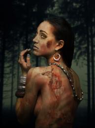 by Se7eN0f9 3802 views - final score: 62.7% | Angry  by dhee 6696 views - final score: 61.7% | terror  by SHIPLEYGIRL 4189 views - final score: 60.5% |
stay at home dont go out  by jack2 9616 views - final score: 60.1% | Back From The Grave  by George55 8881 views - final score: 59.5% | nightmare 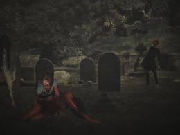 by SHIPLEYGIRL 4336 views - final score: 59.5% |
Angus Scrimm Fan  by Drivenslush 5834 views - final score: 59% | wanna play 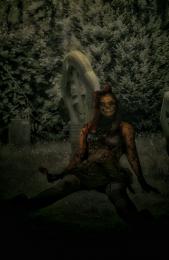 by SHIPLEYGIRL 5867 views - final score: 57.2% | Baby Zombie and the Hakuna Matata Moment  by Drivenslush 11684 views - final score: 56.3% |
Howdie Guest!
You need to be logged in to rate this entry and participate in the contests!
LOGIN HERE or REGISTER FOR FREE
Photography and photoshop contests
We are a community of people with
a passion for photography, graphics and art in general.
Every day new photoshop
and photography contests are posted to compete in. We also have one weekly drawing contest
and one weekly 3D contest!
Participation is 100% free!
Just
register and get
started!
Good luck!
© 2015 Pxleyes.com. All rights reserved.


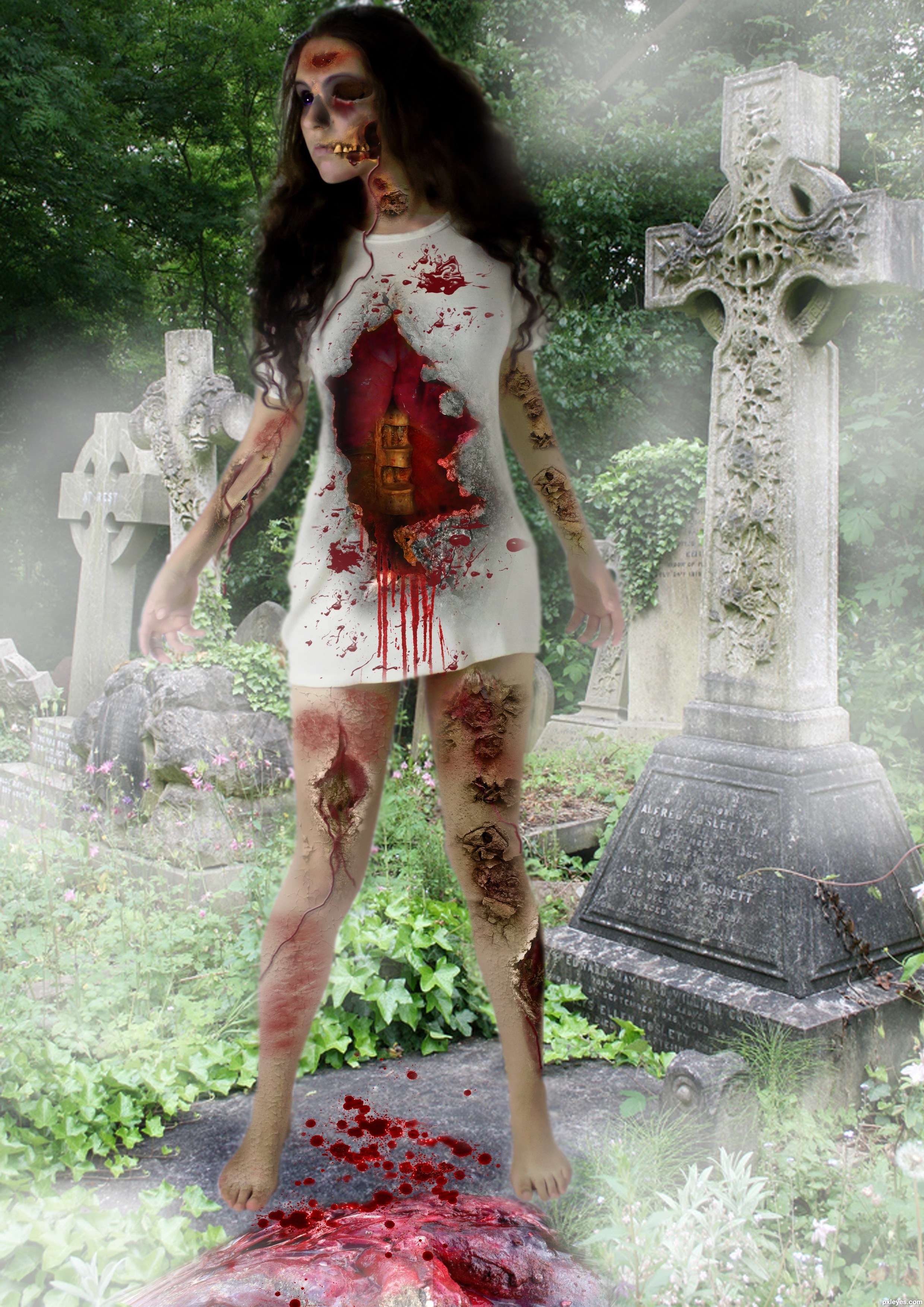
She looks too cut and paste, like she is floating above the walk path. The head is also anatomically off, with the face looking too large and far away from the rest of the head and neck.
An interesting concept, but the technical execution needs a bit more attention to detail.
thanks mossy but i didn't touch the head and neck , take a look at the original picture of the model
You have so many sources, hard to find which one. It will help in the future if you title them such as "head and neck," "lungs," "wound," etc. instead of "Source 1," "Source 2," etc...
You're right, the body is unaltered from your source. It then becomes your overall composition that makes it seem too large and poorly placed within the image. This is a visual "illusion" created by the eye's movement from your other elements, colors, and value choices. But since your focus was a zombie effect, more than an optical illusion of distortion, I still stand by my last statement that your technical execution needs work to create a more visually believable balance of the elements used.
ok thanks
Howdie stranger!
If you want to rate this picture or participate in this contest, just:
LOGIN HERE or REGISTER FOR FREE