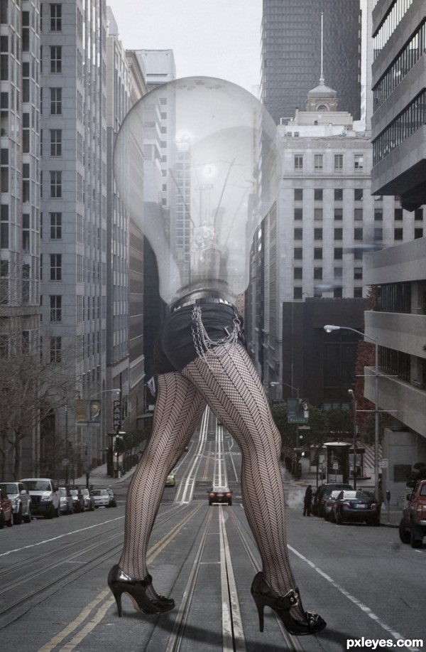
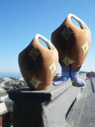
Ever wonder what's been up with the leg lamp from A Christmas story? I think she's been working in the film industry again as a light director.
Thanks to *mirengraphics for the street photo :)
Thanks to James Bow for the Light bulb
Thanks to ~DigitalissSTOCK for the legs
Thanks to =night-fate-stock for the texture that was hardly used but still used. (5 years and 2731 days ago)
- 1: street
- 2: Light Bulb
- 3: Legs
- 4: texture



very good..idea and work. bravo
Glad you liked it thanks
Really good concept...IMO would be even better in muted color, but still sweet.
Thank you cmyk changed to the muted color
Thanks for the comment's I changed it to where it had a little more color, I liked both the black and white and the muted color idea too just couldn't decide but the muted color seems to give a more vintage feel
  . Thanks cmyk
fantastic pics ! I can see the winner
Thank you
Nice blend. However, this character is simply way too gigantic for the scene. There is not enough distance - implied or actual - between her and the closest car in the background, or balance between the size of "yellow lines" in the street compared to her shoe next to them, to justify the degree of disproportion. I'm not suggesting she should be humanly proportionate, just not so gigantic for the surroundings. A very easy fix would be to re-size the background larger.
That may be taste, but this is technical: the shadows are cast in the wrong direction for the light pattern on the legs - all you have to do is look at the real shadows in the original to see that the light on the legs is coming from the front, not the back, as your added shadows imply. To fix this, you can darken the front of the legs and brighten the back of the legs. Or you can try flipping that background.
Having to re-do it over, since some how I saved all the merged layers instead of the full layers in the .psd document. I really like where it is, if I wanted to be technical about it, the bulb would be small but it's fantasy based contest. I will remove the shadow's make the bulb a tad bit smaller, the view is from the floor up so she looks taller that way. Thanks again for the suggestions to make the pic better
Ugh! The dreaded "flatten layers" Oh well. You're welcome.
Congrats, it was close!
Congrats!!
Congratulations!
Thanks guys
Howdie stranger!
If you want to rate this picture or participate in this contest, just:
LOGIN HERE or REGISTER FOR FREE