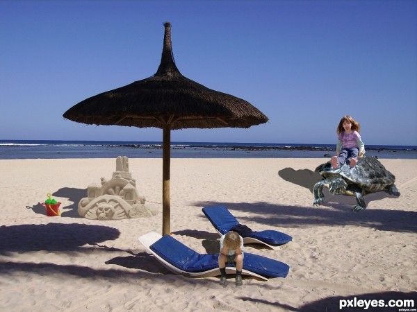
1 i copy pasted a sandcastle and lightened it
2 i copy pasted a boy added it to the scene
3 i copy pasted a bucket ansd spade lowering the saturation
4 i copy pasted a turtle to the scene
5 i copy pasted the girl lowereing the saturation
6 i copy pasted an icecream added it
7 i made shadows from copy layer coloured it with the paint brush then lowered opacity turned it to an angle until it looked right (5 years and 2809 days ago)


the boy needs shadow on the bed thing
Yes it do ..thanx for your comment
Your shadows could do with being blurred a bit. Also the use of a grounding shadow (a darker shadow right at the base) would help a bit.
Thanx for your comment...i better get some practice
The shadow of the girl on the turtle should be more diagonally: There's a shadow of an out of frame Palm tree which comes from the right, this gives you the direction...
Thank you for your comment..i need a lot of practice
the color of the shadow is wrong..when you add the shadow, there's a box withthe color of the shadow...click that box and select the color of the shadow on the source pic as the new shadow color
Thank you i appreciate your help....are we allowed to alter our submission after we have put it in, it's too late now but i mean in future contests....I'm new at all this
hi again author
the thing is in adding images to the original image , you have to consider some major parameters.
you have to check the perspective of what you are adding depending on the place where you are adding it
it seems to me that the girl and turtle should be much smaller that the boy since they are about 10 m behind the boy .
also you have to check the shadows direction, you are not allowed to put shadows in any direction you want , if the sun is shining from right which in this image thats how it is , you have to set shadows to the left !
but about the boy , you did it wrong.
also the exposure of light on added objects should be checked to , the boy and girl's left part should be darker here since the sun is shining from right.
Thanx for the comment
Thanx for the comment
Nice idea, congratulations!
thank you
Howdie stranger!
If you want to rate this picture or participate in this contest, just:
LOGIN HERE or REGISTER FOR FREE