(5 years and 2721 days ago)
Flight without landing  by divair 16331 views - final score: 68.1% | Imminent  by lchappell 10036 views - final score: 67.2% | 532013  by tnaylor21286 10680 views - final score: 67% |
Horror Movie In 3D  by George55 8248 views - final score: 66.5% | You Think This is Staged?  by pearlie 23242 views - final score: 66% | Secret No More..  by George55 7578 views - final score: 65.9% |
The Legend Continues  by tnaylor21286 4914 views - final score: 65.7% | At At...At At At...Two  by spaceranger 5280 views - final score: 65.7% | High Treason  by lchappell 7075 views - final score: 64.6% |
Stardate  by IDt8r 3943 views - final score: 63.5% | DVAS 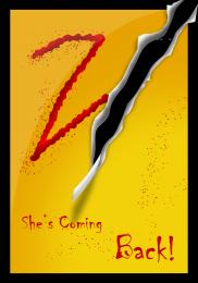 by iquraishi 5349 views - final score: 63.5% | 4 Billion Dollars Later  by Nator 4751 views - final score: 62.7% |
An Overunderdog Story  by musicj19 5539 views - final score: 62.7% | Cute Litle Guys!  by George55 12998 views - final score: 61.6% | "Jodie"  by Drivenslush 2817 views - final score: 61.3% |
spider bite 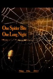 by shizar_phshp 9641 views - final score: 61.2% | Most Wonderful Time of the Year 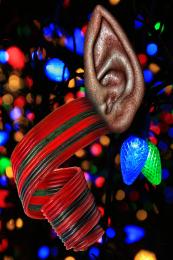 by Drivenslush 9977 views - final score: 58.8% | Booty Shakers 2  by LIONSDEN 6666 views - final score: 58.2% |
Howdie Guest!
You need to be logged in to rate this entry and participate in the contests!
LOGIN HERE or REGISTER FOR FREE
not much of a clue for me.. still a great job
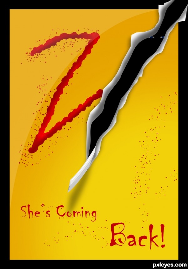
I also am too out of it to know who 'she' is, but nevertheless I find the mysterious simplicity and (kind of) threatening slash compelling. As for messaging, I think a more-succinct "She's BACK" would have greater effect.
I don't get the hard edge that curves through the background and text in the northwest quadrant and that isn't explained in the SBS. I personally just find it distracting.
The slash is not very scary. Stronger shadows and less-bright white might add drama. I also think the black border weakens the impact of the slash. Reconfiguring the '2' so it suffers more from the slash would be more disturbing.
If the thing sticking out of the bottom of the slash is supposed to be some sort of sword, then a steely, metallic finish would make it more recognizable. The eyes inside the slash are difficult to discern. Deleting them would focus attention on the sword. But one identifiable eye peeking out of the slash might add a level of creepiness.
Howdie stranger!
If you want to rate this picture or participate in this contest, just:
LOGIN HERE or REGISTER FOR FREE