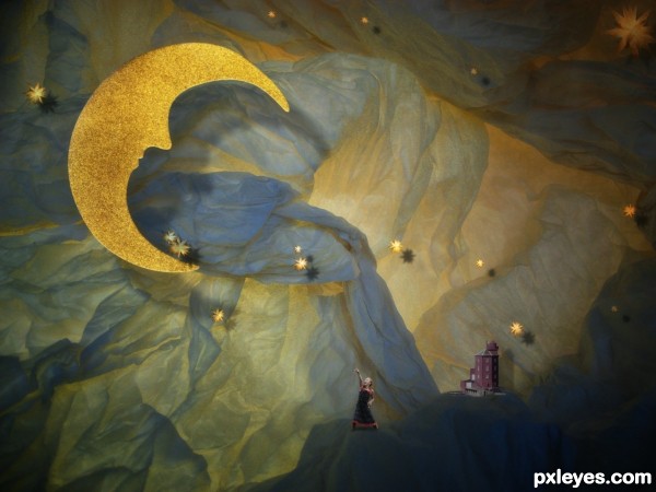
(5 years and 2705 days ago)
4 Sources:
In The Moon  by lolu 11311 views - final score: 69% | luna y luno  by lolu 11733 views - final score: 68.5% | The Moon Was Yellow  by JimLemon 18382 views - final score: 67.4% |
Look at the moon! 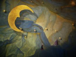 by Circusdoggy 11005 views - final score: 64.9% | We learn the truth about the moon 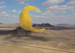 by Circusdoggy 13237 views - final score: 61.8% | Curse of the Moon 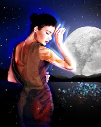 by Hon_Blackrod 14351 views - final score: 61.2% |
In love 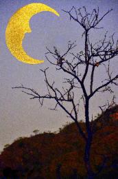 by Chrys Rizzo 4639 views - final score: 59.1% |
Howdie Guest!
You need to be logged in to rate this entry and participate in the contests!
LOGIN HERE or REGISTER FOR FREE
Nice job !
Thanks!
Very creative and fun to portray the artificiality of a theater set. The background source is inspired. I wish there were a greater feeling of depth, however.
First off, I would delete the big star painted onto the upper right corner of the backdrop. At the bottom prong of the moon, the big star above the prong should not be casting a shadow on the prong (as stars are always much farther away than the moon). The medium star below the bottom prong has a shadow that doesn't match the strength of that of the other stars I think the moon's shadow [why is bottom prong's shadow weaker than the shadow for the rest of the moon?] should be moved more southeast to make it seem clearly the foreground element the girl is pointing at.
The girl's meager shadow seems inconsistent with the shadows of all the other elements. I would make the lighthouse bigger (maybe by at least 100%?). And make the blue mountain the girl and lighthouse are standing on darker and crisper to seem more foreground.
Thanks! your comments are appreciated!
Howdie stranger!
If you want to rate this picture or participate in this contest, just:
LOGIN HERE or REGISTER FOR FREE