(5 years and 2652 days ago)
1 Source:
Lost  by Arlo 22739 views - final score: 64.5% | Battle  by kyricom 12255 views - final score: 60.4% |
Howdie Guest!
You need to be logged in to rate this entry and participate in the contests!
LOGIN HERE or REGISTER FOR FREE
Nice one.
Ty
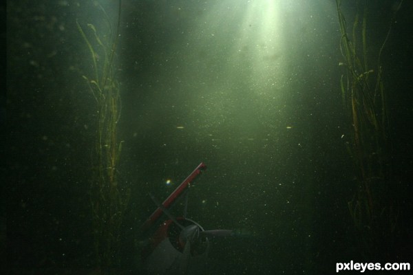
Pretty cool source image! I might have given the plan some more blur so it would fit more with the rest of the image. Or, if you'd like, keep the propellor sharp and the outer sides more blurred so you get some kind of depth of field. Good luck!
Ty for the suggestions.
well done !
ty
nice chop.....IMO just the engine with the propeller is enough , somehow the red part behind distracts the overall image but that's just me . good luck
Thanks
Very nice, well done. I think I like the red part being in. It kind of draws your eye to the area, and then you explore there more closely.
thank you
Congrats!!
ty
Congrats
Howdie stranger!
If you want to rate this picture or participate in this contest, just:
LOGIN HERE or REGISTER FOR FREE