(5 years and 2631 days ago)
5 Sources:
- 1: Woman
- 2: Man
- 3: City
- 4: Motherboard
- 5: Meat
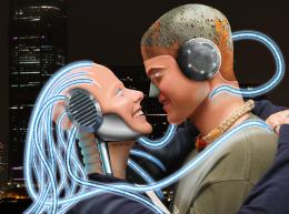
Opposites Attract  by JamesD 31133 views - final score: 70% | connected  by Se7eN0f9 8991 views - final score: 66.6% | evol(o)ve  by altoxis 9523 views - final score: 65.8% |
Howdie Guest!
You need to be logged in to rate this entry and participate in the contests!
LOGIN HERE or REGISTER FOR FREE
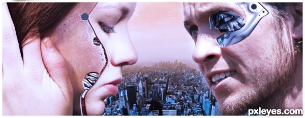
Your final version is too red. You've lost the yellows in the flesh tones and now they have no contrast with the background sky. The shadow of the metal piece next to his nose could use a tweak. Since the light is from above, there wouldn't be a shadow on the top edge, and I don't get the white edge at the end...but otherwise it's a great interpretation of the contest goal. GL author.
PS: Good title!
As you can see in the SBS,the sky was blue and skin was yellow ish,the fact that those too are quiet similar is intentional,the purpose is in fact to get two complementary color (orange and blue)and reduce the impression that those characters are not in the scene.regarding the light and shadow,you are right,they are not accurate.
Good concept. I hope all voters look at the hi res to appreciate whay you have done.
I don't mind the (lack of) contrast between the figures and the background sky, but had choosen for another color adjustment. At sunset, the sky turns red when looking into the sun. At that moment when you would look in the opposite direction, the sky will not be that red. But in your image the faces are clearly lit by the sun. Apart from that is a good job!
Howdie stranger!
If you want to rate this picture or participate in this contest, just:
LOGIN HERE or REGISTER FOR FREE