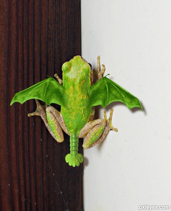
I want one! (5 years and 2624 days ago)
3 Sources:
Fippish  by RickLaMesa 8128 views - final score: 73% | Flying frog  by CMYK46 13457 views - final score: 69.2% | Horned Iguana Owl  by lchappell 17555 views - final score: 68.3% |
Snog 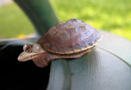 by RickLaMesa 5040 views - final score: 67.7% | Snailfishadillo  by CMYK46 5330 views - final score: 67.6% | Leopard frowlg 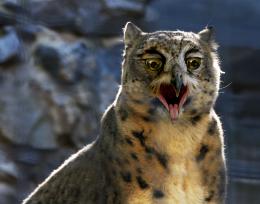 by Glockman 6916 views - final score: 67% |
Zebcociguan 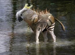 by George55 3352 views - final score: 65.3% | Amphibious Parrotfly 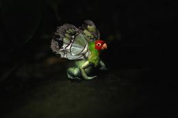 by lchappell 3640 views - final score: 63.8% | El Luchador Desenmascarado 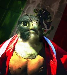 by lchappell 4175 views - final score: 63% |
Howdie Guest!
You need to be logged in to rate this entry and participate in the contests!
LOGIN HERE or REGISTER FOR FREE
Pretty cool idea, not a bad job at all. If I could make one observation, that would be about the shadows of it's wings. Maybe lower their opacity slightly would help. Also you might add some wing shadow to the left foot of your frog.
The wing shadow's opacity is already lower than the body shadow in the source pic. Shadow added to leg.
Nice recovery on the shadow over the foot. Maybe it's me but there sure seems to be some noticeable differences in the man made shadows vs. the original. Especially on the white wall.
A brief lesson on shadows: The closer a thing is to the surface upon which the shadow is cast, the darker the shadow. Notice the shadow of the frog body is darkest, as it is closer to the wall. The wings, being higher up, cast a slightly lighter shadow. To observe how shadows work, look at the foot against the white wall...the shadow is very dark right at the wall, and fades with distance.
It also depends on the nature of the light source as to how sharp a shadow is cast, assuming the light source you are 'using' is slightly diffused, you are pretty much spot on IMO; otherwise something that close to a surface would have sharper and darker shadows all around (depending on the nature of the surface)...
It looks as if you have tweaked the shadow since my first observation, for the better I might say. At least you made some shadow...lol
I think what was/is bugging me is the color of the shadow. The shadow area where the wing joins the body on the right side at the rear just beneath the wing itself, could use some attention IMO. (noticeable in the high res)
I like the chop itself and your concept. You've done a commendable job blending the wings and tail, Good luck author.
There was no tweak. It was fine the way it was.
Okay then....whatever you say man.
Very nice GL
GL
nice blending of the body and the wings -- like the colour as well
Dragons and frogs! Awesome! I love it, and think you did a great job blending the wings and frog body.
very realistic ! Good luck author
Nice blending of sources.... good luck!
Well blended, good pick of sources. The simple division into two planes works very well.
Brilliant work. Awesome. Well done !
Congrats Bob!
Congrats!!
Congrats!
Howdie stranger!
If you want to rate this picture or participate in this contest, just:
LOGIN HERE or REGISTER FOR FREE