(5 years and 2633 days ago)
3 Sources:
- 1: kevron2001
- 2: msw
- 3: source3
Somewhere  by Sandra Cristina 11013 views - final score: 66.5% | Cliff Cottage  by borgulation 11825 views - final score: 63% | silent storage  by sienly 11615 views - final score: 61.9% |
In the old days! 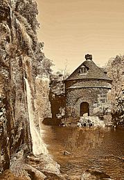 by Chrys Rizzo 9400 views - final score: 61.9% | hills n valleys 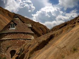 by abir 7165 views - final score: 61.4% | nameless 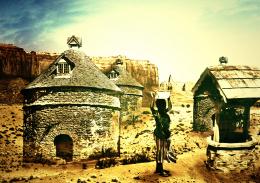 by tnaggar 3720 views - final score: 59.7% |
Way to sky 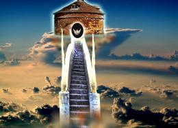 by arifulbk 8108 views - final score: 58.2% | In a tower far, far away... 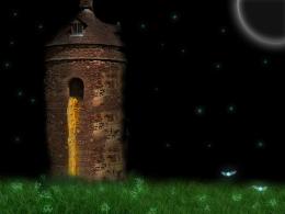 by Ralek 10352 views - final score: 58% |
Howdie Guest!
You need to be logged in to rate this entry and participate in the contests!
LOGIN HERE or REGISTER FOR FREE
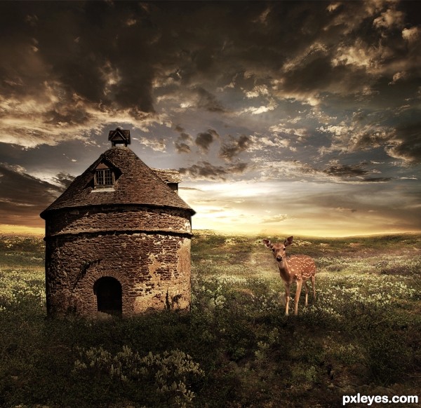
Nicely done. It's usually better to include a hi res version as well. GL author.
Thank you so much!
First I have to say how good I think this looks! however, I would like to see a High Res before I make a decision on what to vote... a step by step though not entirely necessary would also be a nice addition, for those curious and inspired about your entry.
Secondly the shadows cast on the storage hut and your light source don't match. The source photo is from high right and your light source is placed behind low on the storage hut. A subtle hint of highlighting and shadow on the fawn may also be beneficial.
Thank you so much for his comments and tips!
Author, I like where you are headed with this. The composition shows promise aside from what I see as a disparity with the scale of the deer vs. that hut.
As JamesD has stated, there is a problem with the lighting. If you still have your work saved as a PSD ...in the unflattened mode, try flipping the B/G sky layer horizontally. That may correct the direction of the light enough too make this work.
You can edit this entry by going to the "MY Stuff" menu bar across the top of page, there you will see the drop down menu "my contest entries" that's the place which allows you to make changes or edits. I'll withhold my vote untill later. Good luck.
Thank you so much for your comments and help!
I also noticed the enormity of the fawn, lol. I do love the color scheme.
Thank you so much!
Thank you so much!
I like your work on this. Well done. I think the problem with the deer size could be helped by moving him a bit closer forward, which I think shouldn't mean too much editting. The colours and overall feel are very nice. Good luck - I hope you do well with it
i like yours broo!

it's nice but from this view the storehouse wouldn't be illuminated that much rather it would make a silhouette.
Congrats Sandra well done
congrats!!
Good job..& congrats!
Howdie stranger!
If you want to rate this picture or participate in this contest, just:
LOGIN HERE or REGISTER FOR FREE