(5 years and 2624 days ago)
Somewhere  by Sandra Cristina 11000 views - final score: 66.5% | Cliff Cottage  by borgulation 11804 views - final score: 63% | silent storage  by sienly 11594 views - final score: 61.9% |
In the old days! 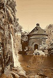 by Chrys Rizzo 9383 views - final score: 61.9% | hills n valleys 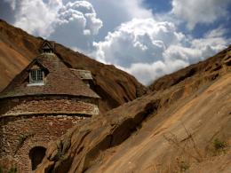 by abir 7143 views - final score: 61.4% | nameless 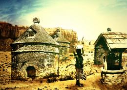 by tnaggar 3715 views - final score: 59.7% |
Way to sky 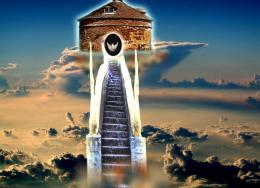 by arifulbk 8101 views - final score: 58.2% | In a tower far, far away... 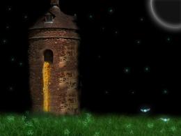 by Ralek 10334 views - final score: 58% |
Howdie Guest!
You need to be logged in to rate this entry and participate in the contests!
LOGIN HERE or REGISTER FOR FREE
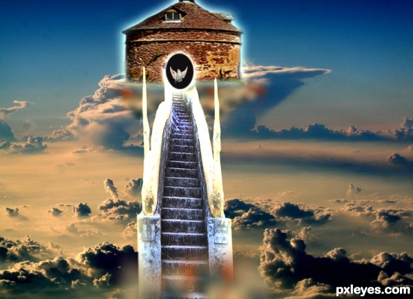
Not bad, but I have a few issues. First of, I think it's a pity that the source image is blurry, while I dont see any reason why of that decision. Then you might want to check your light source: clouds receive light from left, the hut gets light from the right. Finally, there's something with the composition that can be done better. Why is the hut against the top border of the image? Give it more space. Or place it more outside the canvas, up to you. But right now it looks a bit uncomfortable. And well, you dont háve to make the whole image symmetrical, but with such staircase and hut in the middle, I might have expected them centered in the image. Or something completely different, but right now it looks just a bit out of place. Of course just my opinion, feel free to disagree . Good luck!
Thank you sir,
But I am kinda busy with my exam so I am not touching it.
Howdie stranger!
If you want to rate this picture or participate in this contest, just:
LOGIN HERE or REGISTER FOR FREE