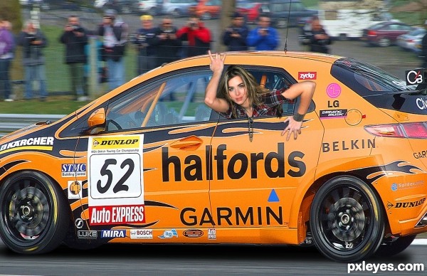
thanks to Paulus62 for car image . (5 years and 2626 days ago)
1 Source:
- 1: car
Mermaid  by lolu 11473 views - final score: 70.9% | Dr skulenborg  by detractor 19378 views - final score: 64.4% | That voice  by detractor 23622 views - final score: 63.9% |
Illusions  by CorneliaMladenova 21645 views - final score: 63.2% | strange tattoo  by SaHdeeQ 14571 views - final score: 63% | bye.. see you again...  by abir 11132 views - final score: 62.3% |
out of car  by chinmay 5439 views - final score: 62.3% | Vampire Girl 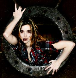 by Julie920503 9958 views - final score: 62.1% | Down in the deep  by saralea 8669 views - final score: 61% |
The POWER Girl  by chinmay 6449 views - final score: 60.5% | You are being observed!  by Chrys Rizzo 8171 views - final score: 60.2% | Wall-Clock  by arifulbk 2882 views - final score: 58.1% |
Howdie Guest!
You need to be logged in to rate this entry and participate in the contests!
LOGIN HERE or REGISTER FOR FREE
initial thoughts: - The window is still closed, and there is no physics to her hair...
u always gives perfect view ..
i tried with window hope it looks better.
everything else in the photo has atleast some level of blur, maybe play with her a little bit, she is too in focus.
Yup,I agree with Keiley22, adding some blur into a woman would make it perfect and more realistic. Good luck author.
I disagree, it's not that she is too in focus, the car has been shot using a high shutter speed, and what looks to be tracked judging by the slight motion blur to the BG. So she would be just as in focus as the car. There is also an obvious difference in the lighting and the amount of noise between the source image and the stock.

So
1) Colour correct her to match the stock (use curves)
2) Add a reflection to the car of 'her' left arm and drop to opacity right down
3) I think you forgot to apply my previous advice to the part of the window under her arm :P and darken those areas even more! also, there is a pale line just where the window meets the 'car' - paint that out.
4) Apply some movement to her hair (either find another stock image, which might be easier / or paint and manipulate the source image)
5) It might be easier to get rid of her necklace than to make it match the scene.
6) It might not work but add a layer of noise and bring the opacity down - just an idea.
Yeh what James D said... i was trying to say that but got stuck on she is too in focus... 6 yr old was naggin my ear off at the same time and i lost my train of thought lol
thanks all for suggestions ..
Howdie stranger!
If you want to rate this picture or participate in this contest, just:
LOGIN HERE or REGISTER FOR FREE