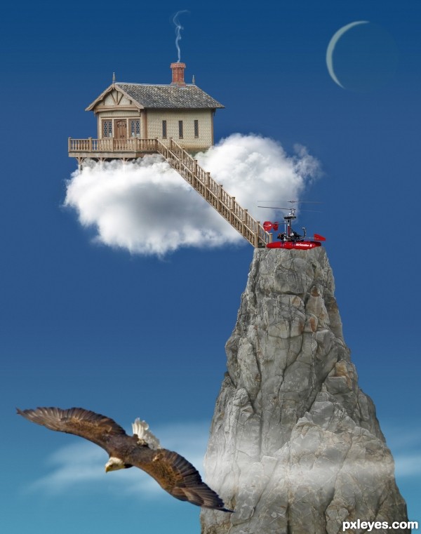
(5 years and 2577 days ago)
8 Sources:
Creepy Castle  by ChristianDarmali 28917 views - final score: 68.1% | Auntie Em!.... Auntie Em!  by buzzy 19087 views - final score: 68.1% | Cloud cottage  by CMYK46 25198 views - final score: 67% |
Cloud 9 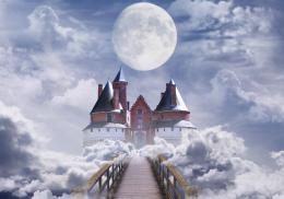 by RickLaMesa 17225 views - final score: 65.5% | colorfull living 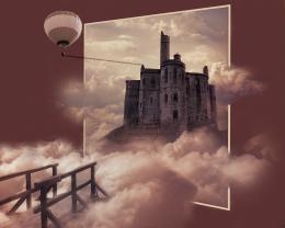 by Se7eN0f9 10388 views - final score: 64.3% | Little Piece of Heaven 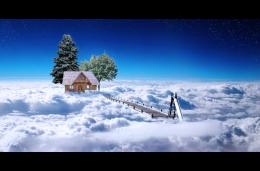 by musicj19 14322 views - final score: 64.2% |
His Heavenly Home 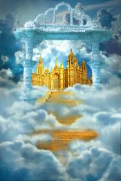 by artgirl1935 16029 views - final score: 63.6% | Penthouse 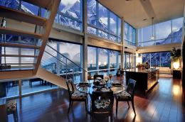 by filantrop 6917 views - final score: 62.4% | Kids Dream 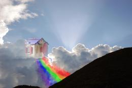 by Zmanphoto 15088 views - final score: 58.8% |
Howdie Guest!
You need to be logged in to rate this entry and participate in the contests!
LOGIN HERE or REGISTER FOR FREE
I love what you've done with this. There is a simplicity and clarity that I think works very well for this entry. I understand the purpose of the eagle, however, in my opinion, I don't think it's needed and that it detracts from the main elements.
Anywho, good luck!
IMHO the eagle creates depth, but I can see your point.
great fantasy and work, bravo
reminds me a little of the movie 'Up' . I like your clarity and simplicity . the eagle makes a nice extra focus point to help the rule of thirds & balance the composition i think. well done & good luck
the work is well done.. I think you could have nestled the house a little more into the cloud.... IMHO I find the house looks as if it is supported by the ladder.... but that's me... good luck
Howdie stranger!
If you want to rate this picture or participate in this contest, just:
LOGIN HERE or REGISTER FOR FREE