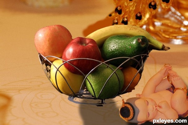
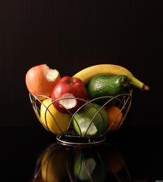
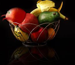
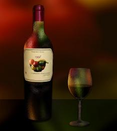
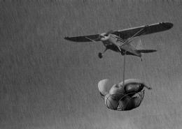
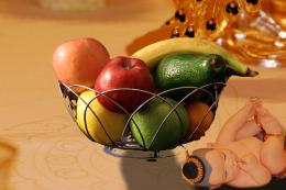
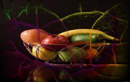
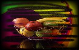
first I saved the image of the thai boy decoration on the table from flickr and the image of the fruit basket from pxleyes into the 'pictures' folder. Second I used quick selection tool and put it all around the thai boy decoration and I unlocked the layer and pressed 'delete'. Then I got another image of the table with the thai boy on top of the table and I used the lasso tool and after I was done I took the cursor and put the thai boy away from the picture. I got a picture of the fruit basket and used the eraser tool and erased the black areas. then I shrinked the image by going to edit> free transform. I took the picture of the thai boy and dragged it next to the place where it says the name of the file you opened and I placed the thai boy next to the fruit basket. Then I clicked on the layer for the two images of the fruit basket and the thai boy and checked the box for 'drop shadow' and clicked on it. Then I messed with the distance and size and moved with the 'move' tool to the left. (5 years and 2668 days ago)
- 1: source1






Why?
Because the Thai boy is a decoration
Look at the light source. The basket needs a shadow.
I will do that at 2 o clock today.
Author, with the shadow, may I suggest you get a bowl put it on a table and look at the shadow cast. Drop shadows are not the best way to add shadows. The light comes from the top left, so the shadow would be on the right behind and not as tall as the fruit basket. When something is on a surface like a table, the shadow always starts at the contact point. If you take a selection of the fruit basket, put it on a separate layer under the fruit bowl layer and fill it with black, then bring the opacity down. Use the transform and distort tool to pull the top of the shadow to the right and a little down. Shadows tend to be a stronger and sharper at the contact point and lighter and more blurred further away. I hope this helps, good luck
I didn't know how to use the transform and distort tool without the drop shadow. I hope this looks good now.
well tried all the best
Howdie stranger!
If you want to rate this picture or participate in this contest, just:
LOGIN HERE or REGISTER FOR FREE